
How to Change Calibre’s Icon Theme, Default Font, and Design
Bored with Calibre’s default look? No problem. Here’s how to change its icons.
With Calibre you can not only edit and manage your eBook collection with a wealth of sorting and filtering options, you can also customize the look of this popular open-source program more and more thanks to frequent updates. In another article we already explained how to change the background image of the cover view. What we didn’t mention back then is that there’s a lot more you can tweak. We’ll take a look at those options in the article below.
After launching Calibre, go to Preferences and then to the “Appearance” submenu.
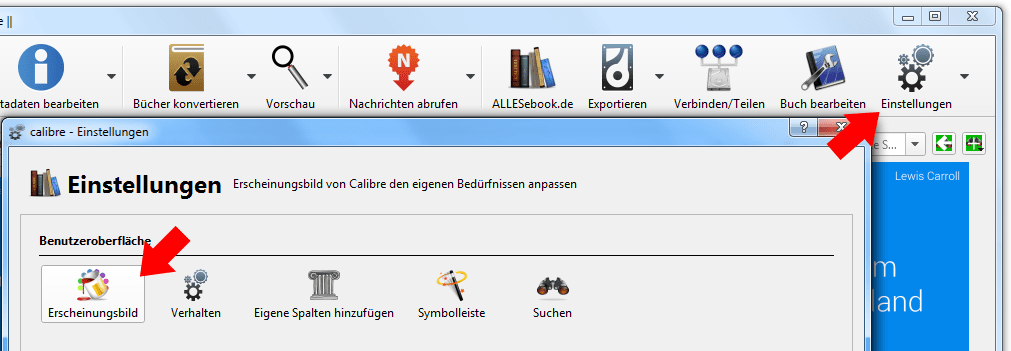
Preferences > Appearance
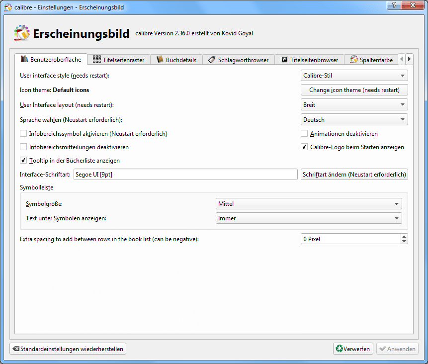
Right on the first tab (User Interface) you’ll find the key options to change the look and ultimately the “look and feel” of the software. Let’s go through the most important ones step by step.
The “User Interface Style” option lets you switch between the “smoothed” Calibre style and the system default. While the Calibre style uses rounded edges and soft transitions, using the system default makes Calibre look a bit dated, with harsh shading and transitions. In general, you can just leave this setting as it is.
Options
Change Icon Theme
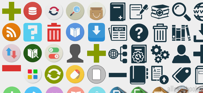
The next item, “Icon Theme,” is much more interesting and only arrived with version 2.36. It lets you replace the program icons with others. You can choose from predefined bundles that are offered and downloaded directly. At the time of writing (September 2015), Calibre offers eleven different themes, and there will likely be more over time.

Several icon themes to choose from
You’re free to pick whatever you like and, with a simple selection, change a key part of Calibre’s appearance. As a rule of thumb, I’d recommend sorting the themes by the number of included icons and choosing accordingly. If you pick an icon pack with only a few icons, you’ll end up with an unattractive mix of the new look and the regular Calibre style.
Personally, I really like the Numix theme, so with one click on the preview and another press of the OK button it was downloaded and applied automatically. For the changes to take effect, confirm in the settings window by clicking Apply and then restart Calibre.
Additional options
But not so fast—we’re not done with the remaining settings. You can set the User Interface Layout to “narrow” or “wide,” with the latter being the better choice for today’s widescreen monitors. The language selection is self-explanatory.
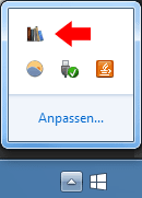
Notification area icon in action
The next item, “Notification area icon,” activates the icon in the Windows taskbar (next to the clock). Once the box is checked, you’ll see a Calibre icon among the others. The most important change here concerns minimizing when you click the close button: Calibre will keep running in the background and must be exited via the notification area (system tray) icon.
Another important item is the default font for the user interface. Click “Change font” to adjust it. I personally prefer Windows’ default font Segoe UI at size 9. That makes Calibre blend in much better with the rest of the system, at least to my eye. Just make your selection in the pop-up.

Font selection
Last but not least, you can also customize the toolbar’s appearance, change the icon size, and show or hide labels.
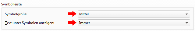
Customize the toolbar appearance
Once you’ve changed all these settings to your liking, confirm the adjustments and you’ll be prompted to restart the program. That’s it—with the options described you can really personalize Calibre’s look so that after the restart it genuinely looks quite different. With that in mind: have fun experimenting!
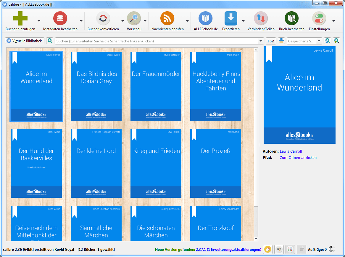
Calibre with a new look