A Beautiful Misstep? reMarkable Paper Pro Move REVIEW
At first glance, the reMarkable Paper Pro Move looks like the perfect digital notebook for life on the go: a compact build, refined styling, vibrant colours thanks to E-Ink Gallery 3, and—finally—searchable handwritten notes. Look closer, though, and the trade-offs become obvious.
The device costs far more than it should, feels awkward at times, and its unusually narrow screen quickly feels cramped when you’re writing in portrait mode. Still, much of that familiar reMarkable magic is intact—smart, streamlined software, a responsive pen, and respectable battery life (while writing).
Yet for a premium, writing-first product, the reMarkable Paper Pro Move makes a few baffling choices.
Video review
Hardware & design
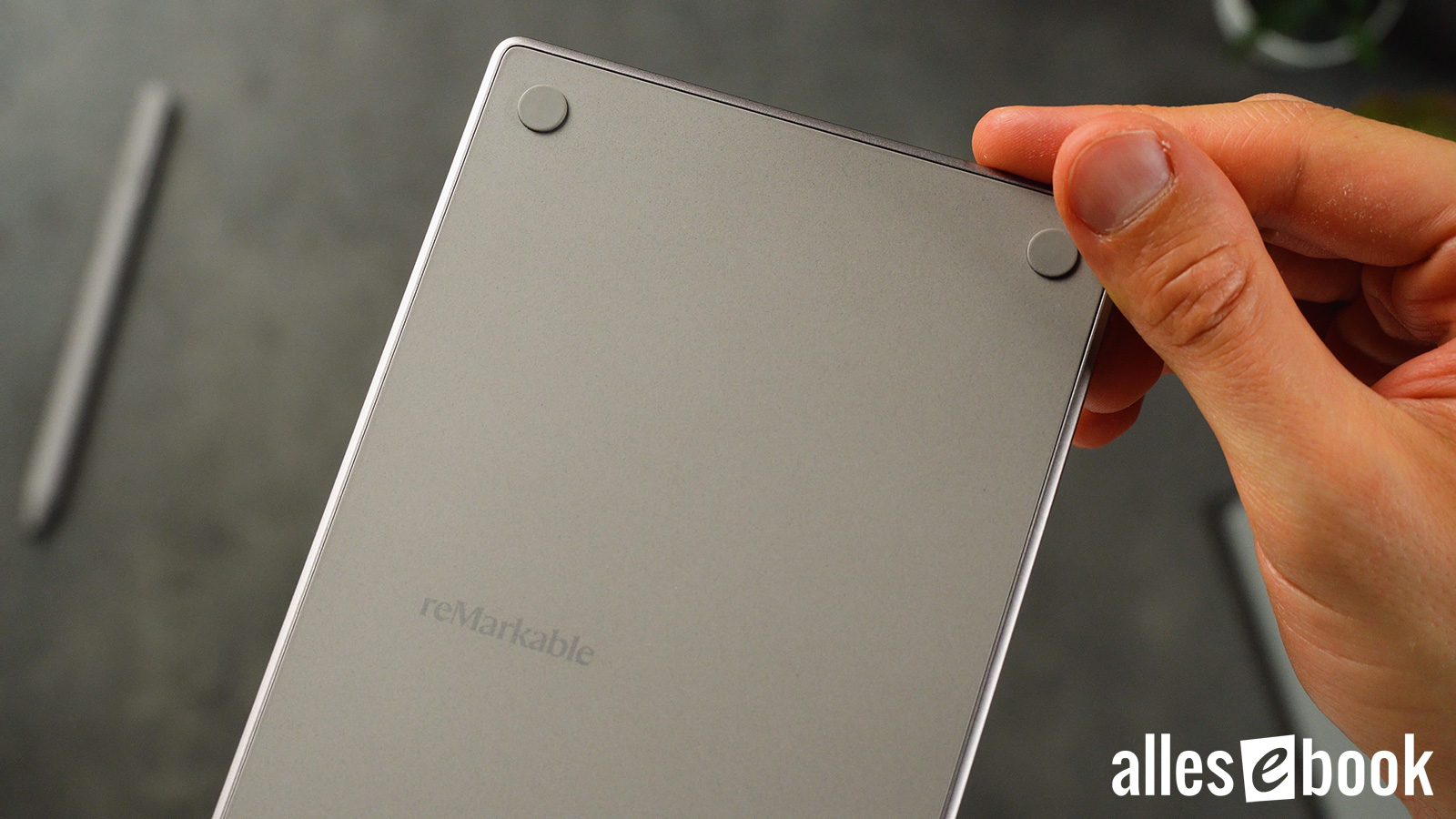
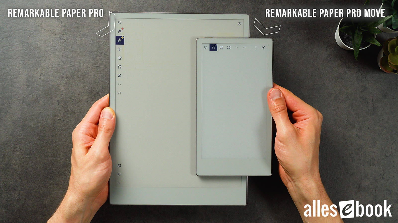
Visually, the hardware is spot-on. reMarkable has shrunk the larger Paper Pro without losing its character. The Move is a hair thicker, yet at just 230 g it’s pleasantly light—on par with a Kindle Colorsoft.
Handy, but not exactly small
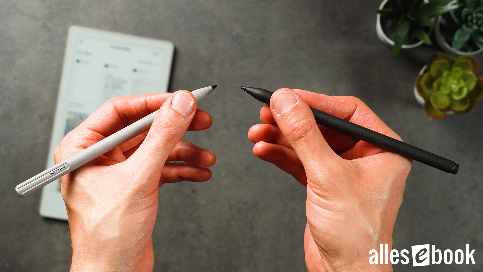
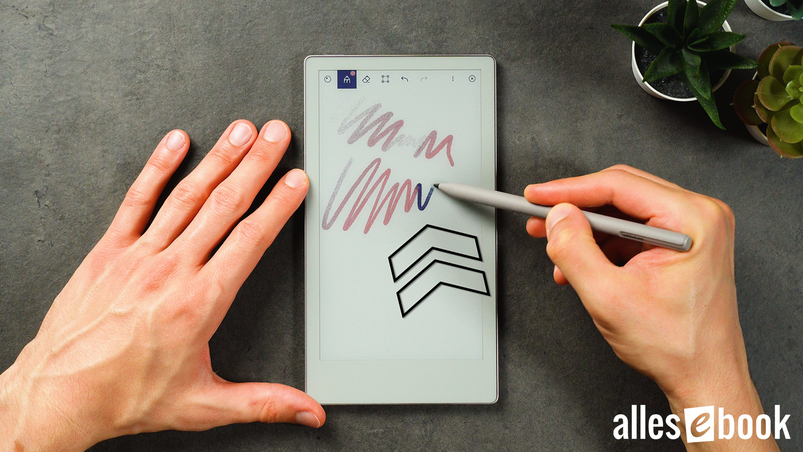
The aluminium frame feels premium and, with its stepped edges, resembles a real notepad. The active stylus snaps on magnetically, charges wirelessly, and wakes the tablet the moment you pull it free—no fuss about battery life.
But corners were clearly cut elsewhere. The back is now textured plastic instead of aluminium (as on the Paper Pro). It doesn’t feel cheap, yet it’s noticeably less up-market and sounds hollow in places. The screen, especially near the bottom edge, also has a slight hollow flex when you write. Not a deal-breaker, but annoying at this price.
This time the back is textured plastic that feels a bit hollow in places
Ergonomics & format
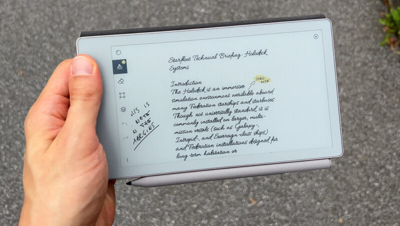
Rubber feet keep it steady on a desk, yet day-to-day handling is less convincing than expected. In portrait, it’s awkward to use flat on a table with your wrist bent; the whole posture feels off. It’s much nicer held below eye-level, gripped in one hand—the Move is well balanced that way.

Hold the reMarkable Paper Pro Move well below eye level and it suddenly feels much better
Landscape mode gives you a natural grip along the wide chin, but comfort isn’t markedly better than on rival tablets. The narrow 16:9 panel rarely beats classic 4:3 ratios. In fact, portrait writing feels tight. Devices like the Supernote Nomad or Boox Tab Mini C (both 4:3) clearly have the edge here.
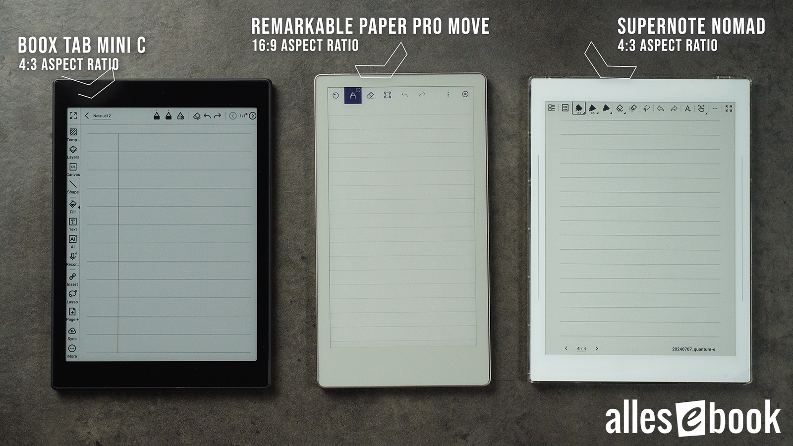
The Paper Pro Move’s skinny aspect ratio (centre) makes lines noticeably shorter than on competitors (left: Boox Tab Mini C; right: Supernote Nomad)
And the supposed mobility gain? Yes, the Move slips into a roomy coat pocket—just not into jeans, unless you force it. Since it takes up about as much space as a smartphone, the real-world benefit is marginal. More often than not the narrow display is a limitation, not a perk.
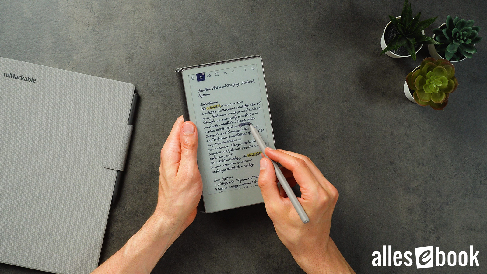
Writing experience & display quality
The core note-taking tools are rock solid, but again the screen format is the key weakness. At 16:9 it feels small and constricted in portrait. reMarkable’s zoom, scroll, and rotate gestures are top-notch—better than virtually any rival—but you still run out of room.
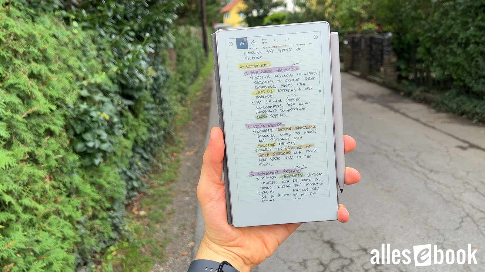
The feel matches the larger Paper Pro: a slightly gritty surface delivers a pleasing, analogue scratch. It’s a bit noisy at first, but you soon tune it out.
Space aside, it’s a pleasant writing surface
Pen accuracy is high: even tiny lettering stays crisp. Compared with something like the Boox Go 7, strokes land far more precisely. Those familiar “wobbly” diagonal lines caused by capacitive USI tech are here too—sometimes more obvious than on my big Paper Pro.
Not a big deal for everyday notes, but sketchers will notice. Latency sits around 20 ms, giving a snappy, near-instant feel.
Marker and Marker Plus
Colour display in detail
The 7.3-inch panel uses E-Ink Gallery 3. Unlike Kaleido, it doesn’t put a colour filter over a mono layer; instead, CMYW microcapsules blend roughly 20,000 hues—the same idea as four-colour printing. The downside: more visible “flicker” when the screen refreshes, especially with pen strokes. A coloured line appears in a mixed tone first, then settles. Black strokes skip this step, so they look calmer.
Line colours finalise in two passes
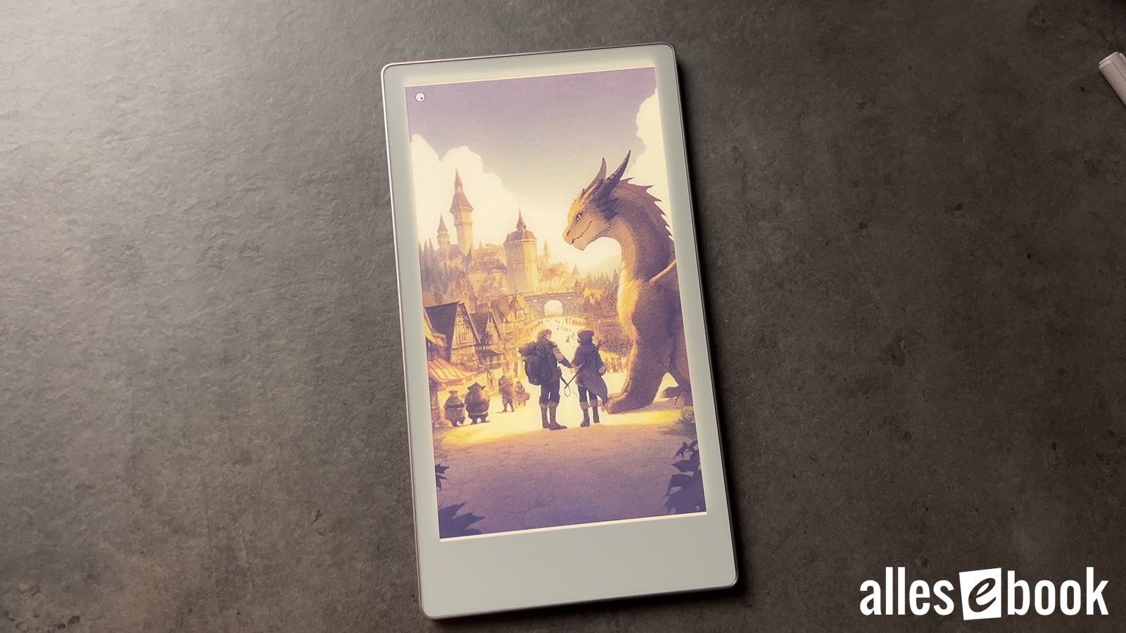
Colours aren’t punchy, but they’re noticeably more natural than Kaleido—especially without the front-light.
At 264 ppi the Move beats its bigger sibling on resolution, which helps with PDFs and makes comics pop a bit more.
Of course, it’s no OLED; colours remain muted next to any LCD or OLED panel. In practice you stop comparing after a few hours—the Move just feels like a digital notebook, and the ‘washed-out’ look fades from mind.
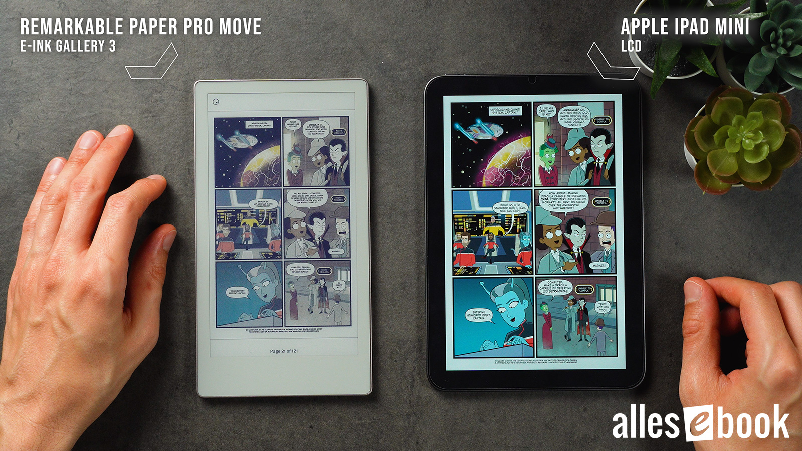
Colours look pale next to LCD, yet still easy on the eyes
One quirk is coil-whine: a faint, high-pitched noise when the screen updates. As with the larger model, you’ll only hear it in a silent room.
The Move’s screen also improves on its predecessor. The background is visibly more neutral, with far less yellow. Measured brightness is only a hair higher (L\* = 63 vs. 62), but the perception is cleaner and more appealing right away.
Noticeably more neutral background on the Move (right) compared with the Paper Pro (left)
You do sacrifice about 7 % colour saturation—most obvious in magentas and reds. For day-to-day use, it’s a worthwhile trade: the overall experience is friendlier.
Black tones shift a touch bluer than on the big model, moving roughly seven degrees towards pure blue (ΔE ≈ 0.94). Under ideal lighting you can spot it; in normal use it’s barely there.

Blacks on the Paper Pro Move lean a touch bluer
The built-in front-light uses reMarkable’s new dimming system. It still tops out around 9 nits—far dimmer than rivals—but it genuinely helps in gloomy or mixed light, and colours look a bit richer.
Even better, brightness is uniform. Where the larger Paper Pro suffered patchy lighting and colour shifts, the Move’s glow is smooth and even. A clear upgrade.
One gripe remains: no adjustable colour temperature. The light sits at roughly 4,500 K—neutral enough, but on a €500 device you’d expect warm and cool options.
Even front-light, though still dim at just 9–10 nits
Ghosting behaves much like the bigger model. In PDFs it’s rare; around the UI you might glimpse faint icon shadows, but they fade within seconds.
Software & handwriting search
The Move runs Codex OS, reMarkable’s trimmed-down Linux. It’s minimal yet well thought-out: tags, folders, page templates, and a strong pen toolkit. The headline addition is handwriting search—finally delivered. Recognition is reliable, though jumping between hits could be slicker.
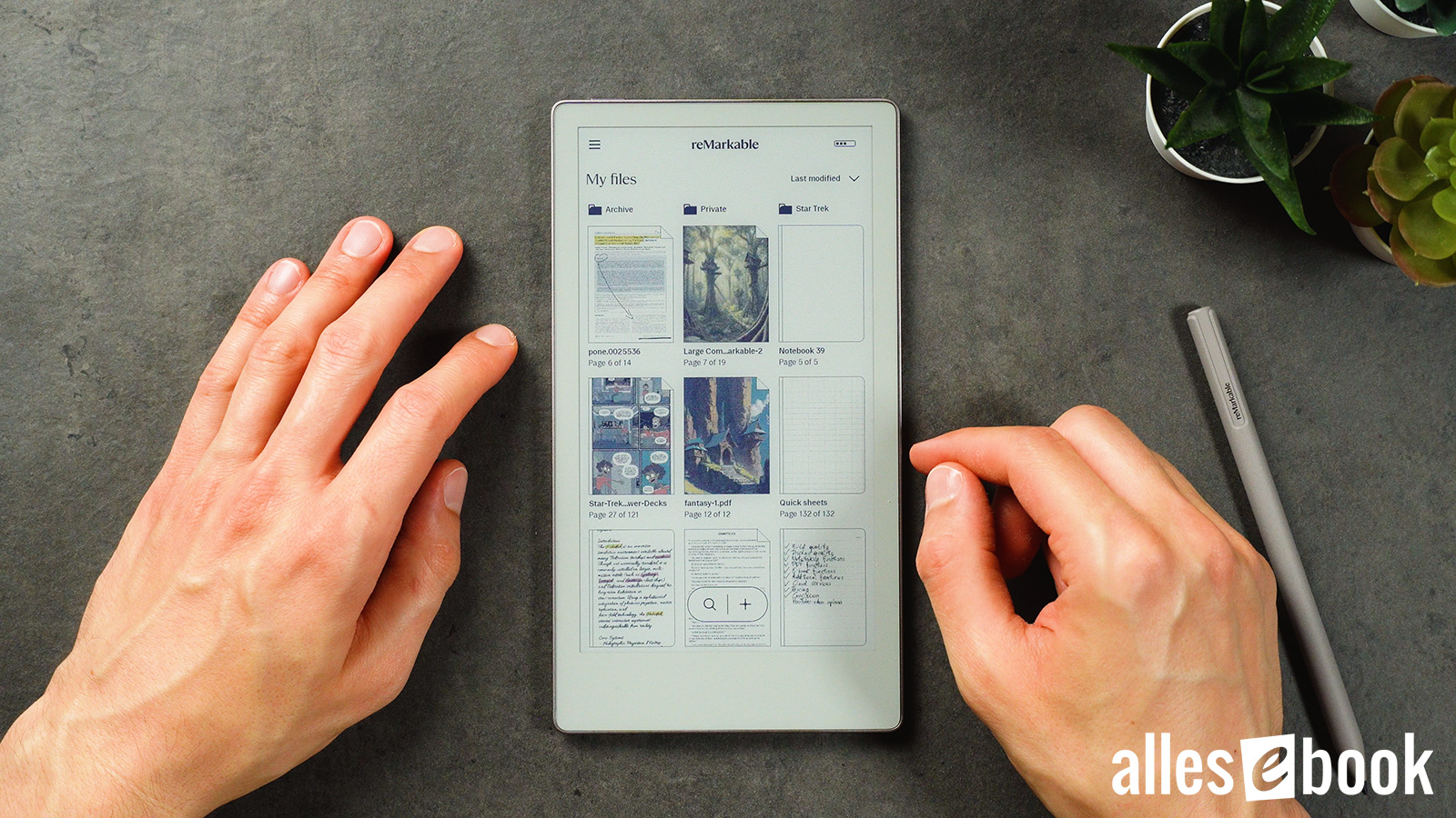
Codex OS: clean and easy to navigate
The catch: it’s locked behind the paid Connect plan. For €3/month or €30/year you get extra templates, cloud backups, mobile apps, and extended warranty—yet charging extra for basic search leaves a sour taste, especially at this price.
Notes sync automatically, but (as far as I can tell) the indexing happens in the cloud, not on-device. Handwriting-to-text works well, but you have to trigger it manually. And text typed on the on-screen QWERTZ keyboard still can’t be freely placed, which feels limiting.
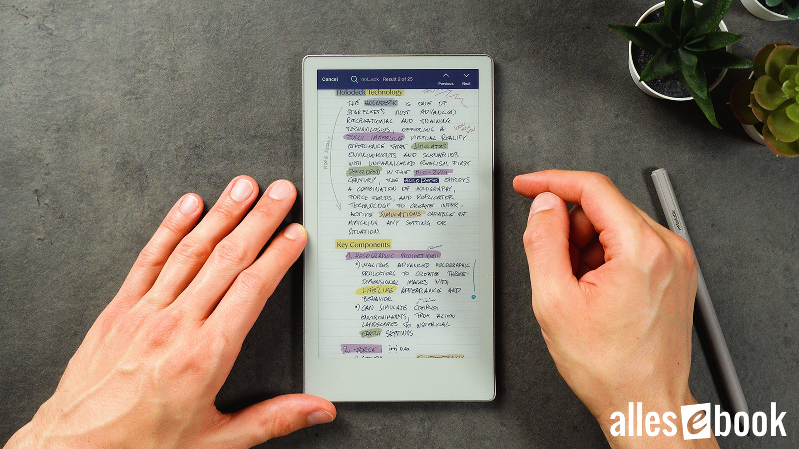
Handwriting search is subscription-only
Security & system features
On the plus side, the system is encrypted by default. Lose the tablet and your data isn’t exposed. But there’s no biometric unlock; at roughly €500, a fingerprint reader would have been welcome.
Compatibility & reading
As an e-reader, the Move is strictly basic. It opens EPUBs and PDFs, but there’s no built-in e-book store, no third-party apps like Kindle, and the reading tools are rudimentary. Typography is fine, though delicate fonts look softer than on plain black-and-white E-Ink.

PDFs are readable, but expect a lot of zooming and scrolling
Excellent zoom and pan gestures partly offset the small screen when you’re viewing larger PDFs.
Battery life & charging
In my battery test the reMarkable Paper Pro Move managed about 5.5 hours of nonstop writing (light off), or roughly 4.5 hours at full brightness. That’s below the larger Paper Pro (6–7 hours), yet decent for this size class.
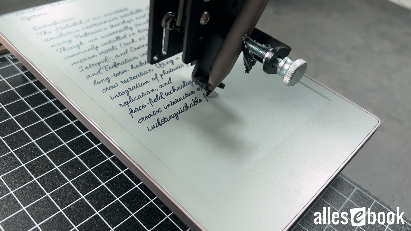
Battery test with a writing robot
Reading is another story: colour PDFs drain it in roughly 5 hours; plain-text PDFs eke out around 7. Both figures trail not only the larger Paper Pro but most E-Ink rivals. In short, it’s not a great reader.
At least fast charging gets you to 90 % in under 45 minutes.
Verdict: classy, but overpriced
The reMarkable Paper Pro Move is stylish, feather-light, and thoughtfully engineered—but its skinny aspect ratio targets a niche. Starting at €479 with the basic Marker and no cover, it’s simply too expensive for what it does.

The reMarkable Paper Pro Move is a capable device overall, but its form factor brings real drawbacks—and the price, in my view, is too high. Spending a bit more on the larger Paper Pro is money well spent.
Opt for the Marker Plus and leather folio and you’re at €629. That’s a hefty sum for what is, realistically, a companion device. If you need a light, focused, colour-E-Ink notebook, the Paper Pro Move is an intriguing niche option. For most people, though, it’s just too pricey—the small jump to the full-sized Paper Pro is easily justified.