PocketBook Color Review: Unveiling Innovative E-Ink Kaleido Technology in eReaders
The announcement of a new color e-reader by PocketBook sparked significant excitement in the tech world. Almost every website reported on it, which is no surprise—color display e-readers have been anticipated for years, yet until now, no device truly suited for the mass market had emerged.
The excitement around PocketBook’s announcement was further amplified by mention of a new, previously unknown E-Ink technology called “Kaleido”. However, specific technical details were not disclosed at the time.
In this review, we’ll take a close look at the PocketBook Color in everyday use and answer the key questions about the device.
Note: The test device was provided by PocketBook in its original sealed packaging with no conditions attached.
Build, Features, and Handling
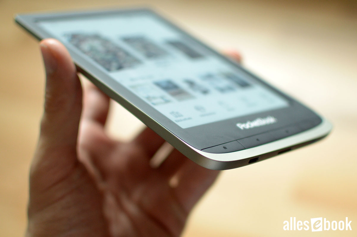
The PocketBook Color continues the design language established by other current PocketBook models. Thus, there are no surprises: The frame around the screen is made from soft-touch material and is narrow, while the customizable physical buttons are located beneath the screen. Below them, a silver frame starts, running along the sides and around the back.
The compact size of 161.3×108×8 mm and the relatively light weight of an official 160 grams (actual measurement: 156 grams) make handling especially easy and comfortable.
As with the latest PocketBook e-readers, the PocketBook Color also offers impeccable workmanship.
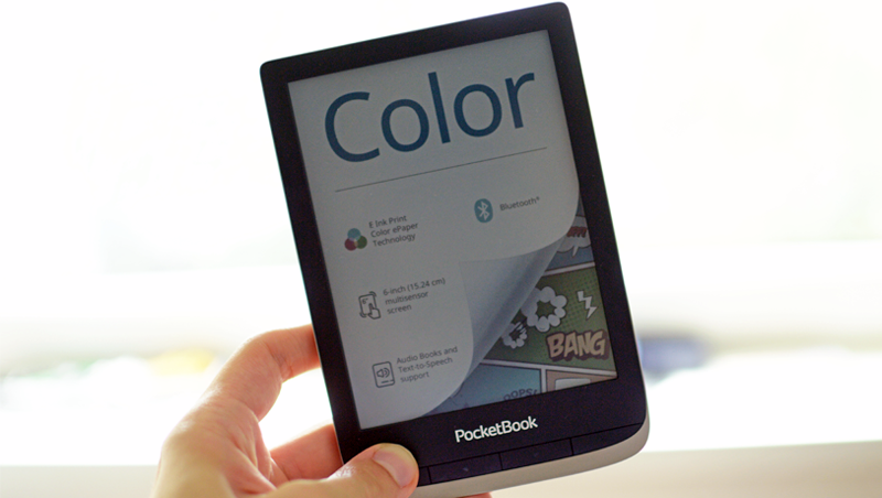
Sleek design, light weight
No corners have been cut when it comes to features. In addition to the now-standard WiFi, Bluetooth is available for audio streaming. The PocketBook Color also supports audiobooks, a feature familiar from other PocketBook models in this price range.
However, you must go without built-in waterproofing, but in return, a microSD card slot is provided to expand the generously sized 16 GB internal storage.
The device runs on a dual-core CPU with 1 GHz clock speed, supported by 1 GB of RAM. A robust 1,900 mAh battery ensures sufficiently long runtimes.
Interestingly, after PocketBook introduced a USB-C port with the InkPad X, the PocketBook Color reverts back to micro-USB.
Display and Lighting
The PocketBook Color is equipped with an illuminated, slightly recessed color display that uses E-Ink technology. This technology, named E-Ink Kaleido, is very new and, until recently, few concrete details about it were available. We’ll take a closer look at this display below and explain how it functions.
E-Ink Kaleido in Theory
The PocketBook Color features a 6-inch E-Ink Carta display with a resolution of 300 ppi (1448×1072 pixels). Specifically, it uses “Carta 1100 ink”, the latest generation of E-Ink’s black-and-white technology, known for particularly high-contrast text rendering.
But that’s only part of the story. The PocketBook Color’s screen isn’t simply a Carta display—it also includes a “Color Filter Array” (CFA), a semi-transparent layer that provides color. This color layer combined with the E-Ink display constitutes the E-Ink Kaleido technology.
Many outlets have mistakenly reported that E-Ink Kaleido’s color output comes from colored ink droplets in the E-Ink display. I initially reached a similar, mistaken conclusion until I came across an E-Ink Holdings press release briefly outlining the real technology. Since then, the E-Ink website has also been updated with the relevant information.
In reality, E-Ink Kaleido is not an evolution of ACeP technology. Thus, the PocketBook Color does not use colored ink. Instead, Kaleido is a significantly improved version of E-Ink Triton 2 technology using a color filter. A Triton-2 display was previously used in the PocketBook Color Lux but had drawbacks that made it impractical for most users.
This means the E-Ink screen of the PocketBook Color is capable of displaying 16 shades of gray. With the help of the thin plastic color filter layer, it can generate up to 4,096 colors. The catch: the resolution of the color layer is only 100 ppi, much lower than the monochrome display (more on that later).
This color layer is now made of plastic, is thinner, and sits closer to the electronic ink than in Triton technology. As a result, the color viewing angle stability is somewhat improved in practice.
How the Color Filter Works
To produce colors, the color layer uses a special version of a Pentile RGB matrix—each pixel is formed by a red, green, and blue subpixel. On a typical LCD, these subpixels are brightened or darkened to create color.
However, the E-Ink Kaleido subpixel matrix differs by arranging subpixels diagonally instead of in stripes. Additionally, the subpixels usually do not align perfectly, and there is a transparent portion above and below, making it technically an RGBW matrix.
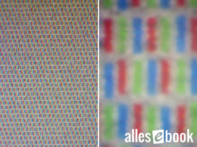
RGBW matrix of the PocketBook Color under a microscope
The RGB matrix of the PocketBook Color’s color filter is darkened from below by the electronic ink.
For instance, to show a green pixel, the blue and red subpixel elements are darkened by the E-Ink display so that only the green subpixel remains visible to the eye, resulting in a green display.
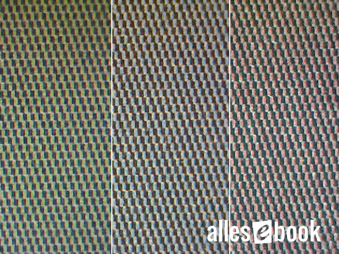
Color representation is achieved by partially darkening the subpixels.
The RGB matrix is also visible under a microscope against a fully darkened black background—not to the naked eye.
Since the ink resolution is 300 ppi, and each subpixel of the color layer can also be darkened in increments, this produces a sort of subpixel rendering. This technique helps ensure that, despite the color layer’s low 100 ppi resolution, the edge sharpness of gradient transitions appears higher than expected for 100 ppi.
On the other hand, the low resolution does become apparent in areas with solid color. Pure color surfaces don’t occur, as the black ink components are quite visible between the colored, undarkened subpixels. This effect is most pronounced with pure red, green, and blue regions, and less so with mixed colors such as yellow, pink, or turquoise.

The PocketBook Color can render complex graphics, but there are inherent limitations due to its 4,096 color cap.
E-Ink Kaleido in Practice
Having explored the basics of the display, let’s examine how the new E-Ink Kaleido technology performs in day-to-day use.
When first unboxing the device, the darker screen background is immediately evident. The difference compared to other E-Ink Carta displays is noticeable, and this is due to the extra color filter layer.

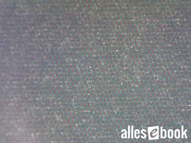
The RGB matrix is always visible…

…here shown in relation to a word at font size 12.
The red and blue subpixels of the RGB matrix cover the screen with tiny, nearly invisible dark dots. Even if the subpixel colors themselves aren’t discernable, this causes the background of the screen to appear darker overall. The transparent (white) subpixel component mentioned previously ensures there’s still sufficient light reflection, so the display isn’t rendered unreadably dark by the color filter.
Lighting is Essential
This all makes it clear from the outset that you should always use the PocketBook Color’s built-in front light when indoors. This compensates for the darkness almost entirely, though you may still see slight traces of those dark dots.
Reading distance is a key factor: the farther away you hold the device, the less noticeable the color filter becomes. If you typically hold the e-reader closer than about 30 centimeters from your eyes, the effect will be more intrusive.
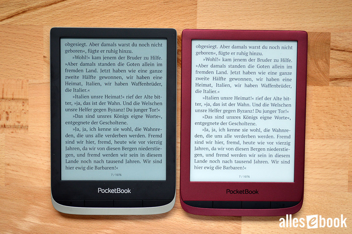
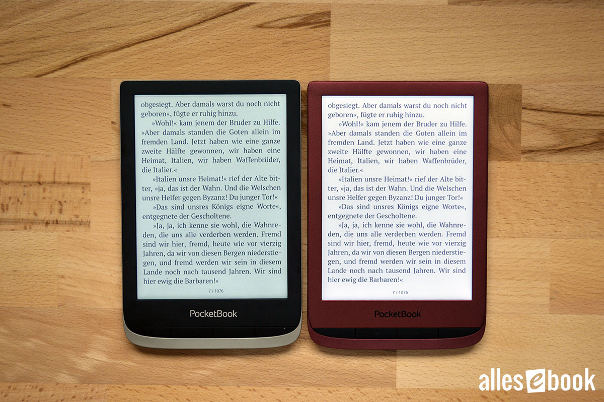
Unilluminated PocketBook Color compared with PocketBook Touch Lux 5. Crisp print but a darker background.
The subpixels have very little influence on text display. With a 300 ppi E-Ink screen, text remains sharp. Depending on reading distance, the subpixels may make some letters look slightly pixelated, but the clarity of black text remains consistently high, in my opinion.
The situation is different with colored text, which appears noticeably more pixelated depending on the color and font thickness, as the color filter’s 100 ppi resolution is decisive in such cases.
Despite the sharpness, text does not appear washed out and remains clear and readable thanks to the bright lighting and good contrast. This was sometimes an issue with the Color Lux, depending on the content.
Colors Bring Freshness
The saturation and brightness of the Kaleido screen surpass those of the old Triton-2 displays, though (as expected) they don’t reach the vibrancy of AMOLED or LCD screens used in tablets and smartphones.
Still, the display quality is solid, and the presence of color livens up the user experience—even something as simple as colorful book covers on the home screen adds new appeal. Only when you switch back to a black-and-white model do you realize how much a color display adds to the experience.
Even small color accents enhance the interface.
True color representation, however, comes into its own only in illustrated eBooks. For a closer look at this, see the “Reading Illustrated eBooks” section below.
Color image build-up speed depends solely on the processor and the E-Ink display itself. The Carta display performs as usual, so image rendering is not slower than on other e-readers. However, a full page refresh is always required to prevent ghosting (more on this below).
Stable Viewing Angle in Landscape Mode
Color display viewing angles in portrait mode are better than what Triton technology offered. Even so, E-Ink Kaleido remains susceptible to color shifting when tilting the e-reader against the vertical axis. In practical terms, this effect is not overly distracting and is generally only noticeable when holding the device at an unusual angle.
More importantly, there’s no color distortion when tilting over the horizontal axis. Thanks to the subpixel placement, color fidelity is maintained even if you tilt the e-reader slightly back for easier holding. There’s no visible color shift.
In landscape mode, the effect is reversed, but because the display’s height is now reduced, color shifting is less apparent in practice.
Lighting Quality
For optimal reading comfort, screen lighting is especially important for e-readers, and this is particularly true for the PocketBook Color.
The lighting is impressively uniform. Only a slight brightness gradient can be discerned on close inspection, but it’s not noticeable in ordinary use. This good uniformity is achieved with 12 LEDs placed in the display’s lower bezel, so any shadowing is minor and confined to the bottom edge of the screen.
The lighting’s color temperature is on the cooler side, skewing slightly towards blue.
Uniform lighting, leans a bit toward blue. PocketBook Color (left) vs. PocketBook Touch Lux 5 (right)
Brightness
The maximum brightness of 99 cd/m² ensures screen content is always clearly legible.
The lowest brightness of 3.1 cd/m² is just about acceptable, but sits at the high end of the scale. For light-sensitive users, this setting may be borderline. Personally, I had no issues, though other e-readers can be dimmed even further.
Maximum Screen Brightness in cd/m² (higher is better)
- Tolino Vision 5 (warm) 175
- Kindle Oasis 3 (cold) 170
- Kindle Oasis 1 159
- Tolino Shine 3 (warm) 146
- Tolino Vision 4 HD (warm) 135
- Kindle Oasis 3 (warm) 131
- Tolino Vision 5 (cold) 130
- Tolino Page 2 126
- Tolino Vision 4 HD (cold) 119
- Tolino Shine 3 (cold) 118
- Kindle Paperwhite 3 115
- Kobo Aura One 105
- PocketBook Color 99
- PocketBook Touch HD 3 (cold) 90
- Kindle Paperwhite 4 90
- Tolino Shine 2 HD 89
- PocketBook InkPad 3 Pro (cold) 85
- PocketBook InkPad 3 (cold) 79
- PocketBook Touch HD 3 (warm) 75
- PocketBook Touch Lux 4 73
- PocketBook InkPad 3 Pro (warm) 73
- PocketBook InkPad 3 (warm) 69
- PocketBook InkPad X (cold) 50
- PocketBook InkPad X (warm) 44
Minimum Screen Brightness in cd/m² (lower is better)
- PocketBook Color 3.1
- Tolino Page 2 3.1
- Tolino Shine 3 (warm) 2.7
- Tolino Vision 5 2.7
- Tolino Vision 4 HD (cold) 2.2
- Kobo Aura One 2.1
- Tolino Shine 2 HD 2.0
- Tolino Vision 4 HD (warm) 1.9
- Tolino Shine 3 (cold) 1.8
- Tolino Vision 5 1.2
- Kindle Paperwhite 4 0.9
- PocketBook Inkpad 3 0.7
- PocketBook Inkpad 3 Pro 0.7
- PocketBook Touch HD 3 0.7
- Kindle Oasis 3 0.6
- PocketBook Touch Lux 4 0.4
- PocketBook Inkpad X 0.4
- Kindle Oasis 1 0.4
- Kindle Paperwhite 3 0.2
Touchscreen and Ghosting
The capacitive touchscreen is quick and precise—there’s nothing to criticize here.
Since the RGB matrix appears to be passive, E-Ink ghosting occurs as expected, just as it does on other e-readers. There are no notable issues, as the software enforces a page refresh whenever colored content is displayed in ePub ebooks.
PFDs and CBR or CBZ comics behave a bit differently. When moving images in zoomed view, a complete refresh does not always occur, which can at times cause visible ghosting. However, this does not happen consistently, and fundamentally the experience is similar to other black-and-white e-readers—but can be more noticeable since ghosting may affect the color presentation as well.
Interim Conclusion on the Display
After this thorough examination of the display technology, it’s time for an interim conclusion. To be blunt: The screen is always easy to read, and overall, the display is clearly a major improvement over Triton-2 technology.
That said, the color display still involves compromise. The subpixels are always visible, making the screen appear darker. Depending on your visual perception and reading distance, you may find the pixel dots somewhat distracting when the lighting is on.
The PocketBook Color offers two crucial advantages over smartphones and tablets. First, the screen is far more readable in direct sunlight, even though modern smartphone screens are now bright enough for temporary outdoor use.
Tablets still offer increased color saturation.
Second, the PocketBook Color is notably more energy efficient. The color layer remains visible even when the device is off, and as far as I can tell, there’s no active control on the RGB matrix during everyday use. This means color viewing is possible without extra power draw, and only the typical E-Ink display power is needed for page construction.
The matter of the missing nightlight is interesting. Whether PocketBook left it out to save costs or to avoid negatively affecting color quality, I can only guess. Whatever the reason, it’s another compromise compared to other high-end models.
Technologically, I find myself wondering about the scalability of E-Ink Kaleido. Higher resolutions would technically bring color layer pixels closer together, making the display darker, unless subpixel transparency could also be actively controlled. Only time will tell if this will become possible, or if ACeP technology will become suited to e-readers.
All in all, the PocketBook Color provides the best and most modern solution for color display on an E-Ink device. While there are a few minor compromises, the result is a successful implementation.
Reading and User-Friendliness
The full breadth of reading features is detailed in the InkPad 3 and Touch HD 3 reviews. As the software is virtually identical on the PocketBook Color, I’ll focus here on its particular advantages and differences in daily use.
Reading Regular eBooks
Of course, the PocketBook Color offers not just colorful content but sharp, clear black text as well, thanks to the 300 ppi display.
As mentioned earlier, its text display differs from other “retina” models in only one respect: Depending upon reading distance, the color filter’s subpixels may sometimes make individual letters appear pixelated.
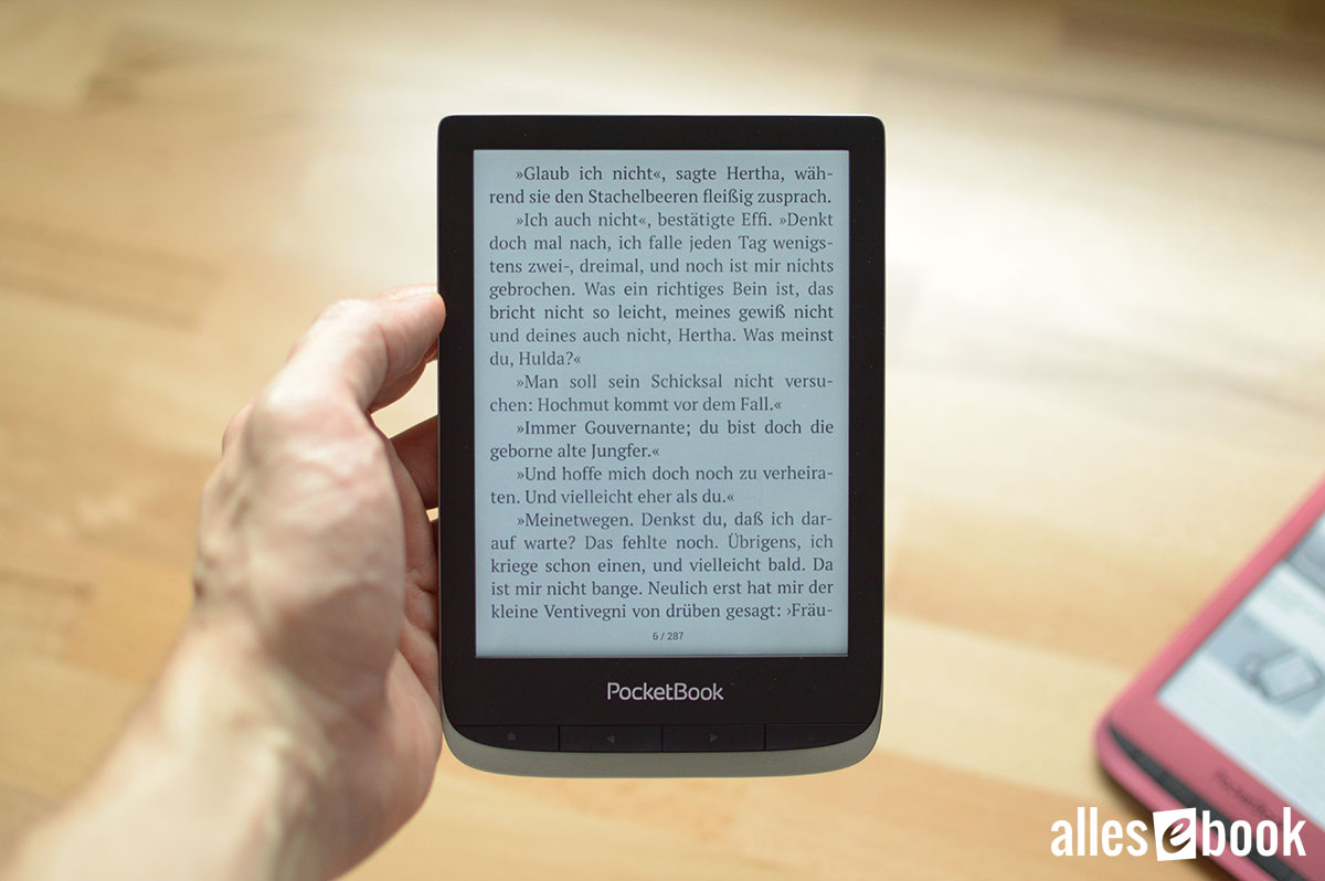
Black text remains easy to read
I mention this for completeness—this detail doesn’t deserve undue weight. Despite it, black text display quality is outstanding.
Reading Illustrated eBooks
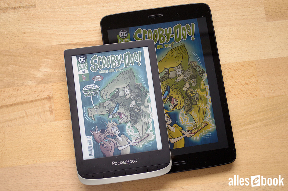
Now to the main highlight: reading richly illustrated eBooks.
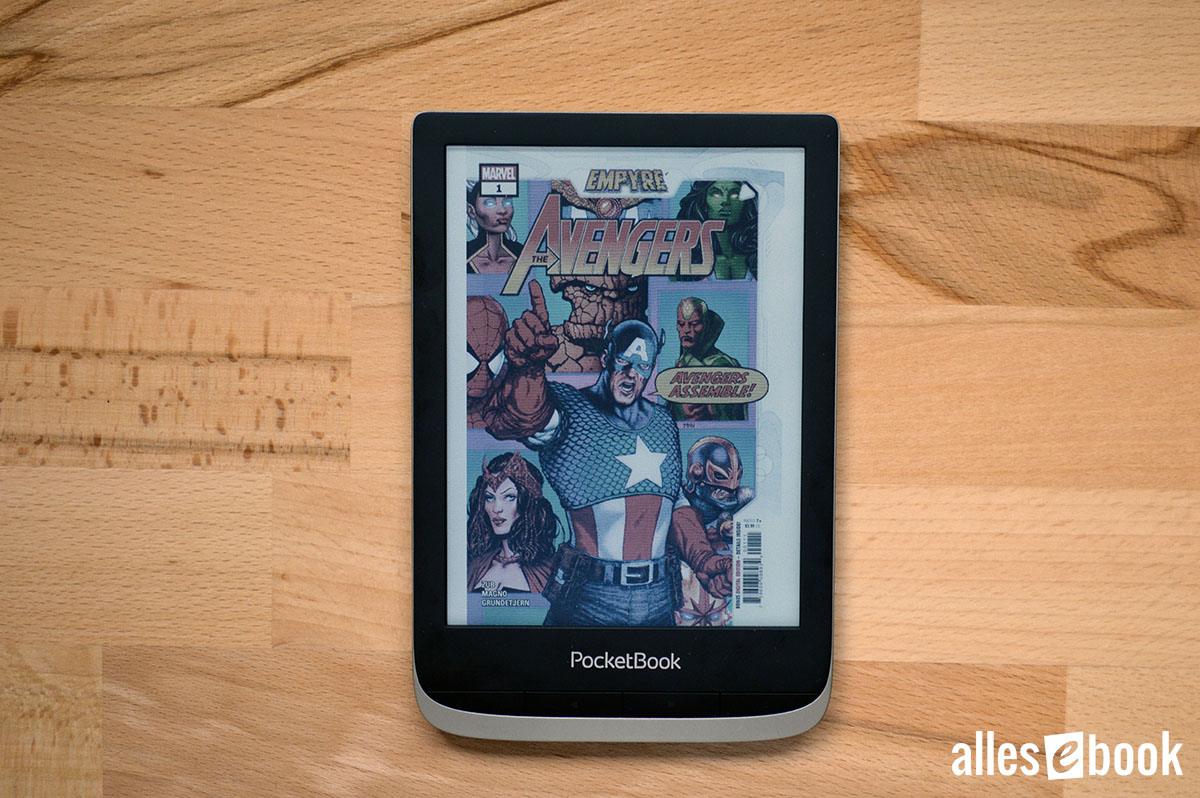
PocketBook clearly targets comic fans with this device. Shortly after the device’s introduction, the manufacturer also updated the firmware of other models to support CBR and CBZ files, the standard comic formats (in addition to PDFs). These are simply RAR or ZIP files with numbered images inside.

Comics are much more striking in color.
Fundamentally, this focus is handled well: contrast, brightness, gamma, and color saturation can be adjusted for CBR and CBZ files. This is especially helpful for older, scanned comics.
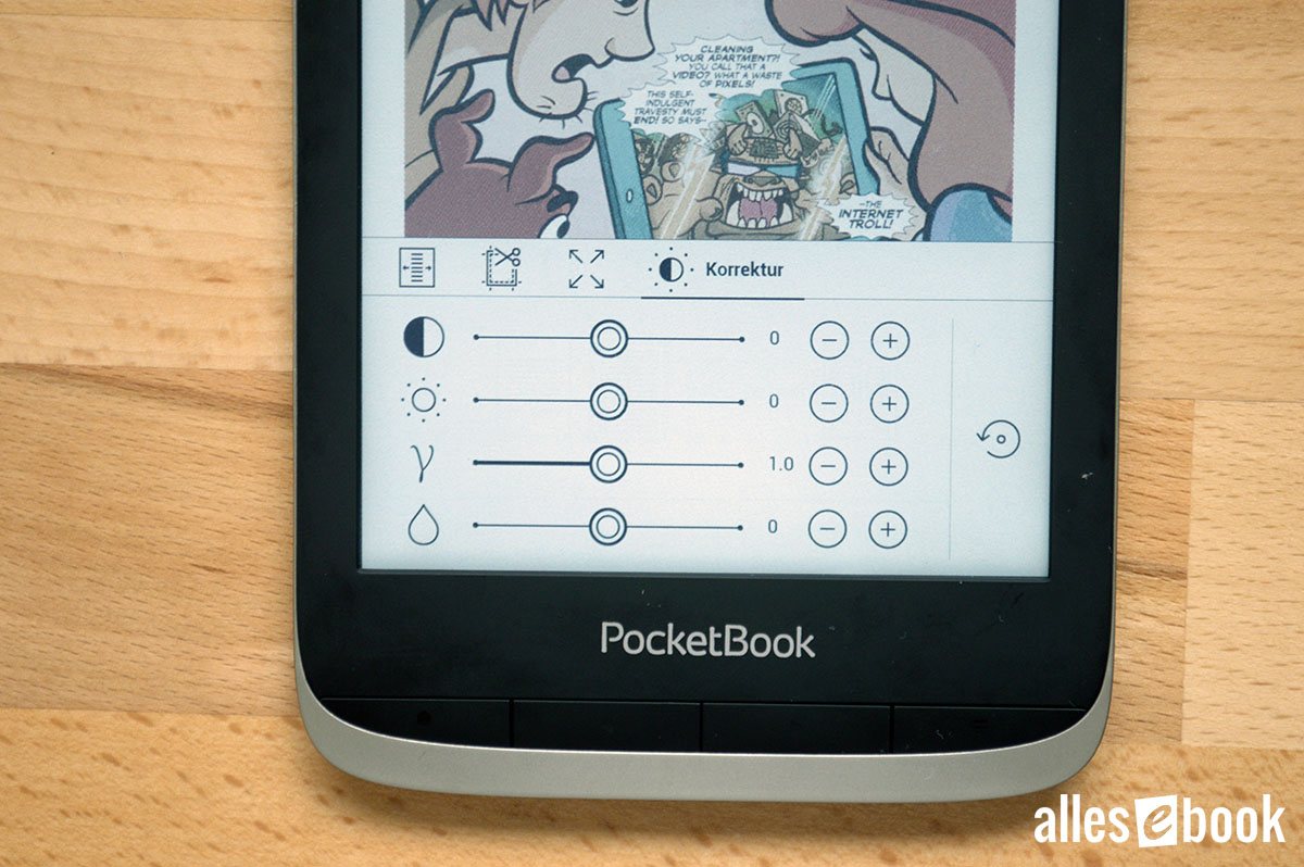
Additional adjustment options for comics
Comics and other files are scaled automatically to the screen size. With the 300 ppi resolution display, even very small black text in speech bubbles remains readable. Colored text, however, appears much more pixelated and is harder to read. In the long run, tiny text—black or colored—can become tiring, so reading in landscape orientation is recommended.
Given the standard comic page size of 26.01 x 16.84 cm, switching to landscape gains valuable centimeters: the 6-inch PocketBook Color screen measures roughly 9 cm wide by 12.1 cm tall. In landscape, you have to sacrifice only about 25% of the width (rather than 43%). However, this means repositioning the visible portion of the page as you read. This can be done using the physical buttons or your finger.
Scrolling through image sections with the buttons is effective. However, depending on comic page format, panels may be cut off, meaning multiple vertical adjustments may be needed to view an entire scene. Some comics are already digitized for use in landscape mode, minimizing the need for workarounds.

Detailed color rendering
Repositioning the image using your finger is less intuitive compared to using the buttons. While moving PDF files with extensive text is quick, pure image documents perform noticeably slower. Response to touch can lag, and redrawing the image after shifting takes longer.
I tested this with original backup files from Comixology in both PDF and CBR formats. As such, comics are practical mainly in portrait mode (albeit quite scaled down) or landscape mode using the buttons. This challenge isn’t limited to color models—other PocketBook e-readers face the same limitations with these file types.
The earlier PocketBook Color Lux, featuring a Triton display, had one clear advantage over its successor: an 8-inch screen, which made comics considerably more comfortable to read.
To make comics easier to navigate on a 6-inch device (or any e-reader), an app with panel recognition—allowing automatic zoom and panel jumps—would be an asset. Whether such a development is worthwhile depends largely on whether consumers show sustained interest in this category.
The Chicken and Egg Problem
By contrast, ePub files containing images fare better. Image loading is snappy, and because they’re already adapted to the page format, there’s no need to adjust the visible portion.
This, however, leads to a chicken-and-egg situation. At present, many eBooks lack color content despite the covers almost always being colorful; interior illustrations are often grayscale.
The result is that you may own a color e-reader but only see grayscale graphics in the eBooks you buy.
I am optimistic that this will gradually change over time, but at present, the potential for disappointment is real.
Familiar, Extensive Features
As expected, the software provides a wealth of features unmatched by any other manufacturer in the 6-inch category. I’ll briefly summarize the essentials, with a full overview available in the previously mentioned reviews.
Library and Reading Features
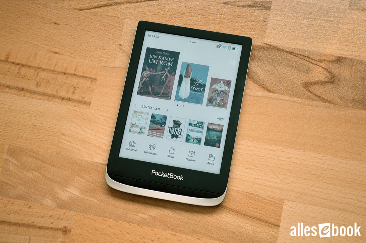
The excellent library function returns, offering numerous ways to sort and filter your eBooks. No other provider furnishes a comparably robust library management system.
The PocketBook Color builds upon this with color display capabilities.
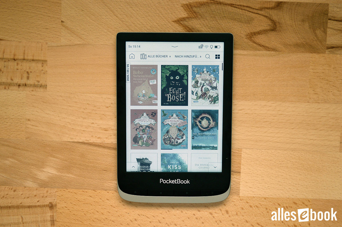
The library is even more attractive in color.
It is undeniably more pleasing to browse a gallery of colorful book covers than a grayscale list. Scrolling through the library is smooth, just as on the company’s monochrome e-readers.
This means the E-Ink display automatically switches to a faster rendering mode while you scroll, sacrificing a little quality for speed. Once you lift your finger, full quality resumes. The colors remain visible even while scrolling.
Font selection is unchanged, and together with the robust library, PocketBook Color offers a wide range of text customization options.
Notes and Dictionary
Note-taking is slightly revised on the PocketBook Color (Firmware U633.6.1.593).
Firstly, there is now a floating context menu that appears directly above a word upon long-press, in addition to the top-of-screen context menu (seen when enabling note-taking mode via the menu).
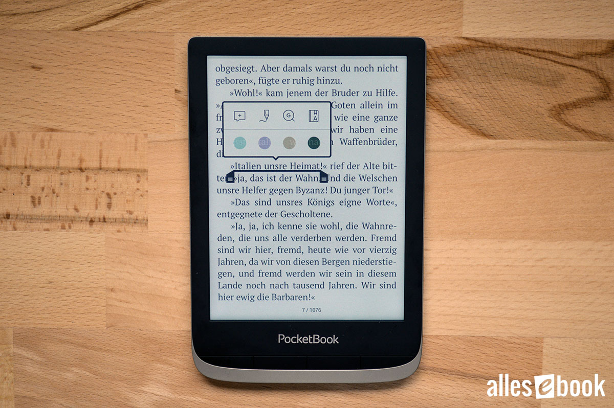
New context menu for note-taking
Unlike with older firmware, these are not two separate modes, but two different display options, so notes can be accessed anytime with a simple tap.
The floating menu also features direct color selection, enabling colorful highlights in turquoise, violet, ochre, or dark green. Freehand notes can be made in these colors, as well as in red, white, and black.
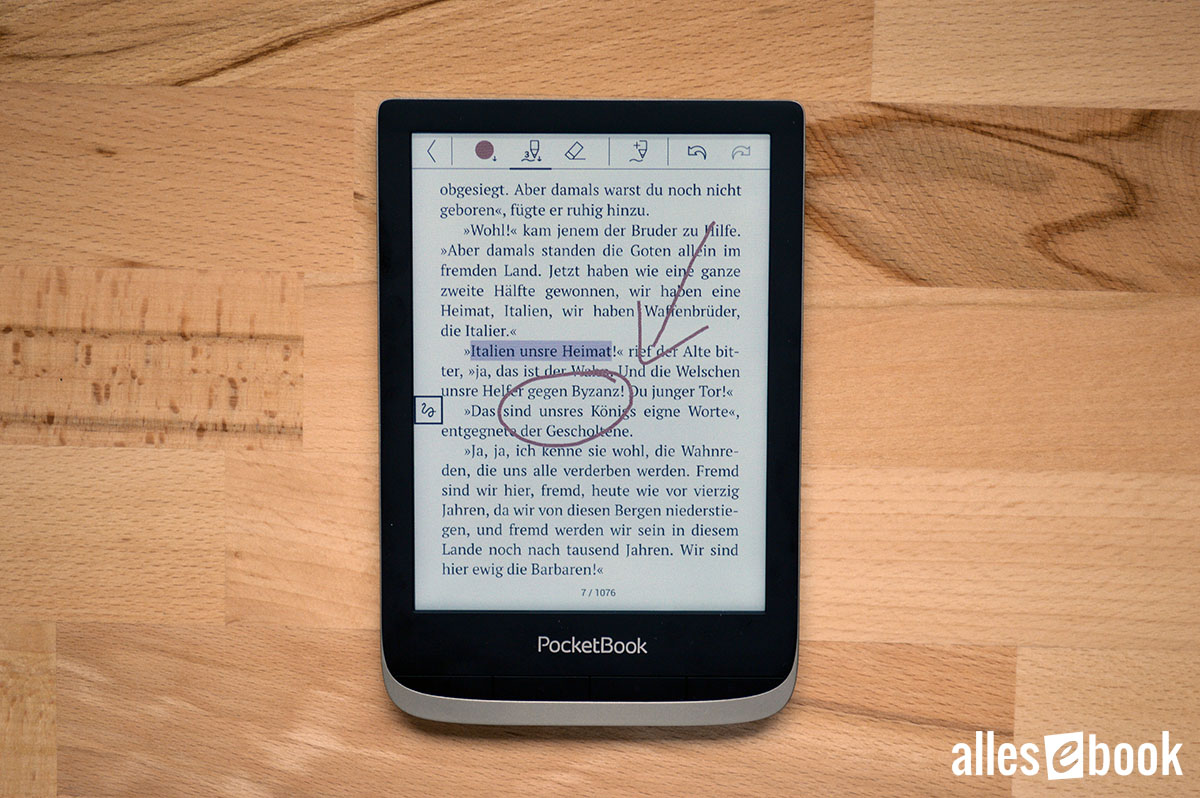
Handwritten notes and marks can be in color as well.
Through the context menu, you can create a comment (the highlighted text is also colorized, which I find somewhat less usable), as well as look up words on Google and in the dictionary. The Readrate social reading feature can be enabled but is easily disabled in the device settings.
In addition, several new dictionaries are included (noted in bold). The following are available:
- GL (Pl-En)
- PS (En-Bg)
- Webster’s 1913 Dictionary
- English-German (nameless)
- Wikcionario (Espanol)
- Wikizionario (Italiano)
- KD (Cs-En)
- KD (Da-En)
- KD (De-En)
- KD (En-Cs)
- KD (En-Da)
- KD (En-De)
- KD (En-Es)
- KD (En-Fi)
- KD (En-Fr)
- KD (En-Hu)
- KD (En-It)
- KD (En-Lt)
- KD (En-Lv)
- KD (En-Nl)
- KD (En-No)
- KD (En-Pl)
- KD (En-Ro)
- KD (En-Sk)
- KD (En-Sl)
- KD (En-Sv)
- KD (Es-En)
- KD (Fr-En)
- KD (It-En)
- KD (No-En)
The minor drawback remains that, as before, it takes two steps to look up a word.
Audiobooks, Music, and Text-to-Speech
Music, audiobooks, and text-to-speech can be played via Bluetooth or with the supplied micro-USB-to-3.5mm adapter.
There is a dedicated audiobook app for listening to audiobooks. A major benefit over the Amazon Kindle is that you aren’t locked into any one provider (such as Audible). You can use MP3 files from any source. Audible audiobooks aren’t supported, which is a minor trade-off for the freedom to buy from various stores and use free audiobooks.
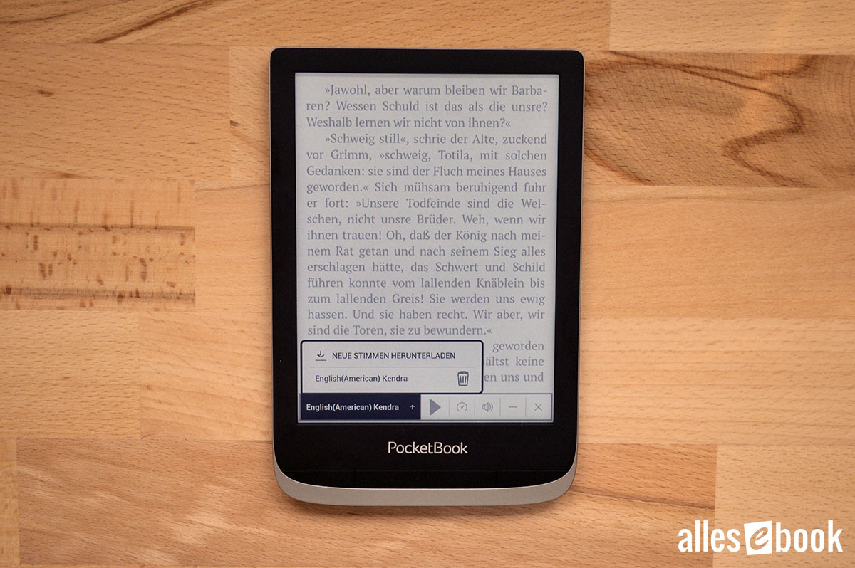
TTS voices can now be installed directly from the menu.
The text-to-speech function is available within eBooks as well, reading the text using a computer-generated voice. While audio quality doesn’t reach that of a professional audiobook, it is usable for daily reading. Additional voices can now be downloaded directly from the menu, greatly simplifying the setup process, as only an English voice is pre-installed by default.
Connectivity Options, Browser, and Games
Several transfer options are worth mentioning. eBooks can be conveniently purchased through the built-in store, which was completely revamped in early 2020.
You can also simply move files onto the internal storage by USB, or use Dropbox or Send-to-PocketBook (via email) for wireless transfers. No other manufacturer offers such a wide variety of options.
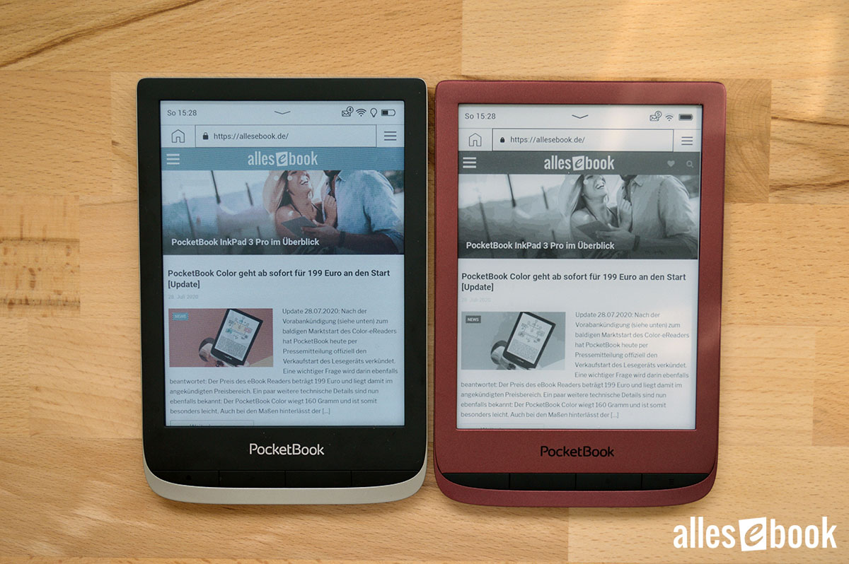
The browser also supports color.
A web browser is included, making it easy to access other bookstores or Onleihe lending services. The browser is also great for reading news. With a Chromium-based engine, website loading works smoothly as usual. An RSS reader is also built in.
The device features games too: chess, sudoku, and solitaire are joined by painting and doodle apps. The painting app comes with colorable images, and you can add your own templates.
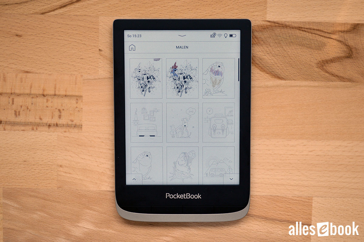
The painting app allows you to color images. Here is the template selection screen.
Conclusion
 As with the test of the PocketBook InkPad X, I took my time with the PocketBook Color to thoroughly assess the e-reader.
After testing dozens of e-readers, I know where to look more closely. But when a manufacturer introduces entirely new technology, I intentionally take more time. This ensures nothing previously unseen goes unnoticed while allowing the innovations to make a lasting impression.
The PocketBook Color is a device for which this extended evaluation period was definitely worthwhile.
Initially, upon unboxing it, I was struck by the dark background color of the unlit display. This left me unsure whether the new color technology would actually live up to its promise.
However, after turning on and using the e-reader, my concerns gradually faded. The color display is noticeably better than the old Triton technology. Within minutes, I was pleasantly surprised by how much colorful book covers refreshed the overall user experience. It’s an effect only truly appreciated by comparison with a standard grayscale e-reader.
But this alone isn’t enough to justify choosing the PocketBook Color. The color display is intended to provide a real advantage—something that holds especially true in children’s books, comics, and non-fiction or technical books, where (often colored) illustrations simply don’t fully translate to grayscale displays.
PocketBook Color
This main purpose makes the PocketBook Color a worthwhile investment—however, it currently still suffers from the chicken-and-egg issue, as many ePub eBooks lack color. Therefore, to leverage the E-Ink Kaleido display, you need to actively seek out the right titles.
With comics, I remain undecided. The color display offers real added value, yet the software could be improved for greater ease of use.
Aside from that: if you primarily read novels without illustrations, you’re ultimately better served by the more affordable Touch HD 3 or Lux 5.
The device’s greatest asset (color display) is also its single significant drawback: visible subpixels. Depending on reading distance and your sensitivity, the tiny colored dots may be more or less noticeable, but they can’t be entirely ignored and are a clear disadvantage versus classic monochrome e-readers. Also, the lack of a nightlight is disappointing since it’s become almost standard nowadays.
Otherwise, the PocketBook Color performs very well: Screen illumination is even, tactile feel and build quality are first-rate, and the software is fast and stable as always. If purchased directly from PocketBook, the updated shop integration is another clear advantage.
It’s also worth noting PocketBook’s dedication to a more user-friendly interface. Over the last one to two years, the company has steadily rolled out enhancements to simplify usage for newcomers to digital reading, and this carries through here as well.
Which brings us back to the central question: Is E-Ink Kaleido technology the next evolutionary step? Yes—and no.
- Yes, because the color display works well and delivers a genuine improvement to the reading experience. The longer you use the device, the less the display’s quirks seem to matter.
- No, because those quirks never quite disappear from view.
Only when the subpixels become invisible (or at least less visible) in the next generation, and when the number of colorfully illustrated eBooks increases, will I confidently call it a true market (r)evolution. For now, the PocketBook Color is best suited to two audiences:
- People who mainly read illustrated eBooks, comics, and documents rich in color, and
- tech-savvy early adopters.
With this, we reach the end of a detailed conclusion about a unique e-reader. On account of its successful implementation, the PocketBook Color earns an overall rating of 1.8.