PocketBook InkPad Color 3 Review
With the InkPad Color 3, PocketBook has, quite unexpectedly, launched a new eBook reader with a color display.
The rapid generational change in the InkPad Color series wasn’t originally planned by PocketBook. But no one seems to have anticipated the predecessor’s big success—neither PocketBook itself nor display maker E Ink. In fact, E Ink couldn’t deliver enough Kaleido Plus screens. As a result, PocketBook had to switch to the newer (and better) Kaleido 3 technology as an alternative.
E Ink Kaleido 3 offers higher color resolution and has already proven to be a very capable display technology in various Chinese E Ink tablets. Expectations for the PocketBook InkPad Color 3 are accordingly high.
So in this review we’ll take a look at how Kaleido 3 improves readability and whether the third InkPad Color e-reader can now be recommended without reservations.
Note: The review unit was supplied by PocketBook with no conditions attached and no influence on the review.
Video review (English)
Below is a summary of the review as an English-language video:
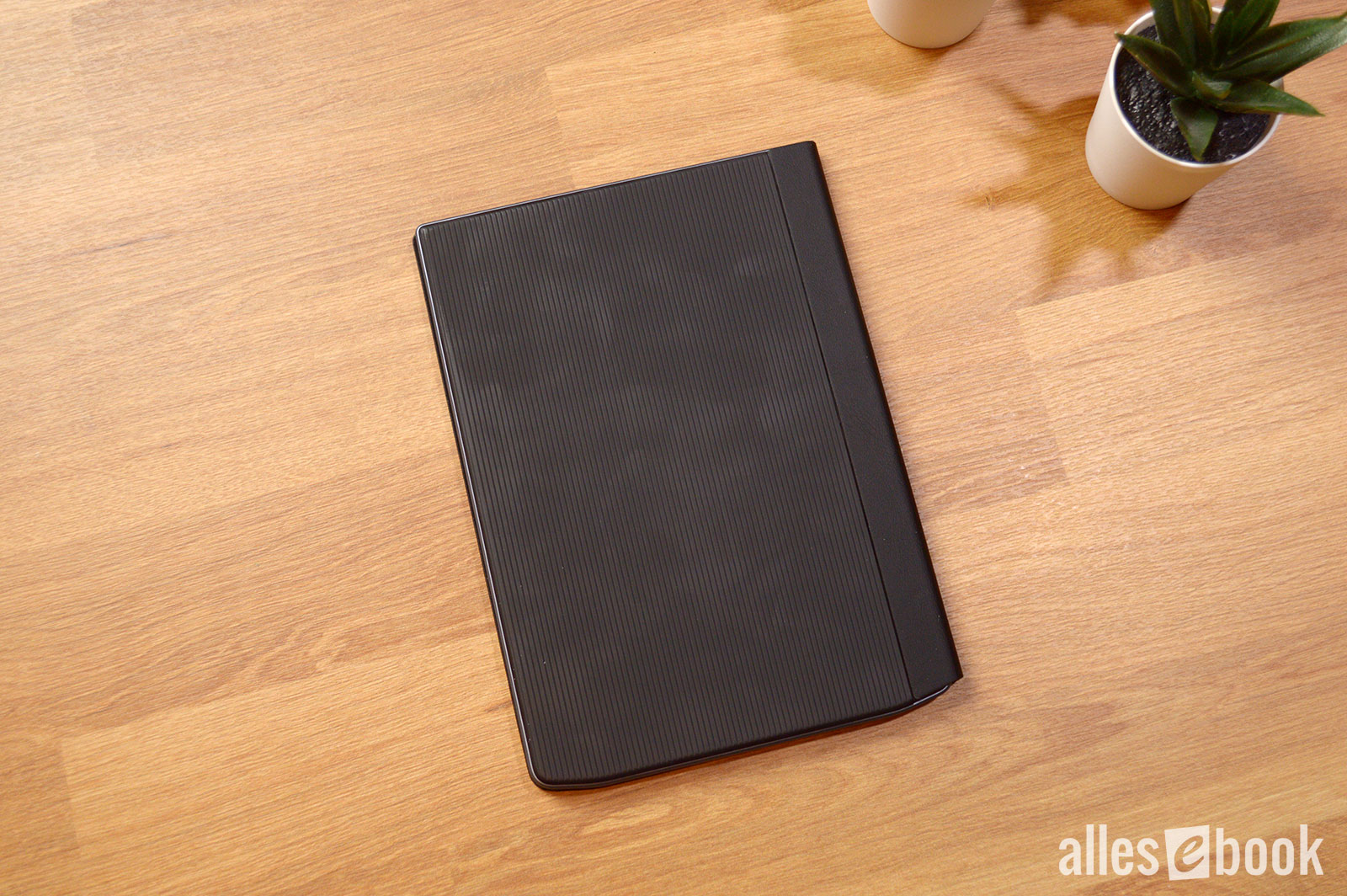
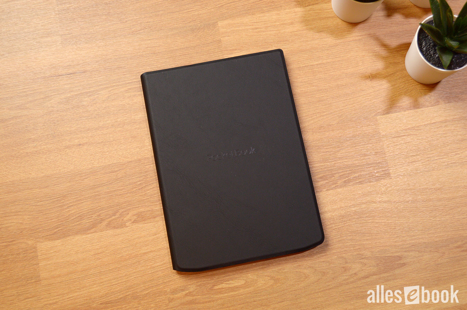
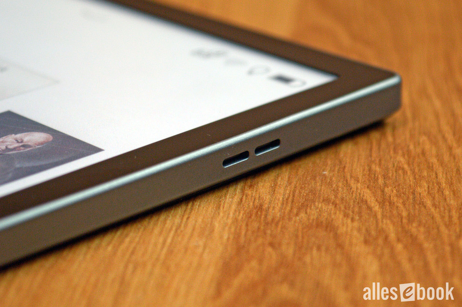
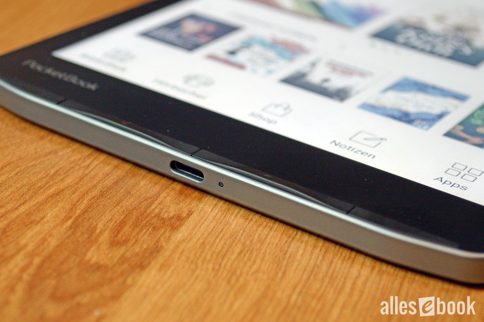
Build quality, features, and handling
Display and frontlight
As mentioned, the InkPad Color 3 uses E Ink Kaleido 3 display technology. The 7.8-inch screen therefore has two different resolutions: 300 ppi for the E Ink layer and 150 ppi for the color layer.
Here’s how it works: On top of a regular grayscale E Ink Carta panel, like the one used in the InkPad 4, there’s an additional semi-transparent RGB layer (red, green, blue) with colored subpixels.
To display a given color, the underlying E Ink pixels are selectively darkened so that only the desired color remains unobstructed. The display then reflects light freely only at that spot, and the intended color is clearly visible to the naked eye.
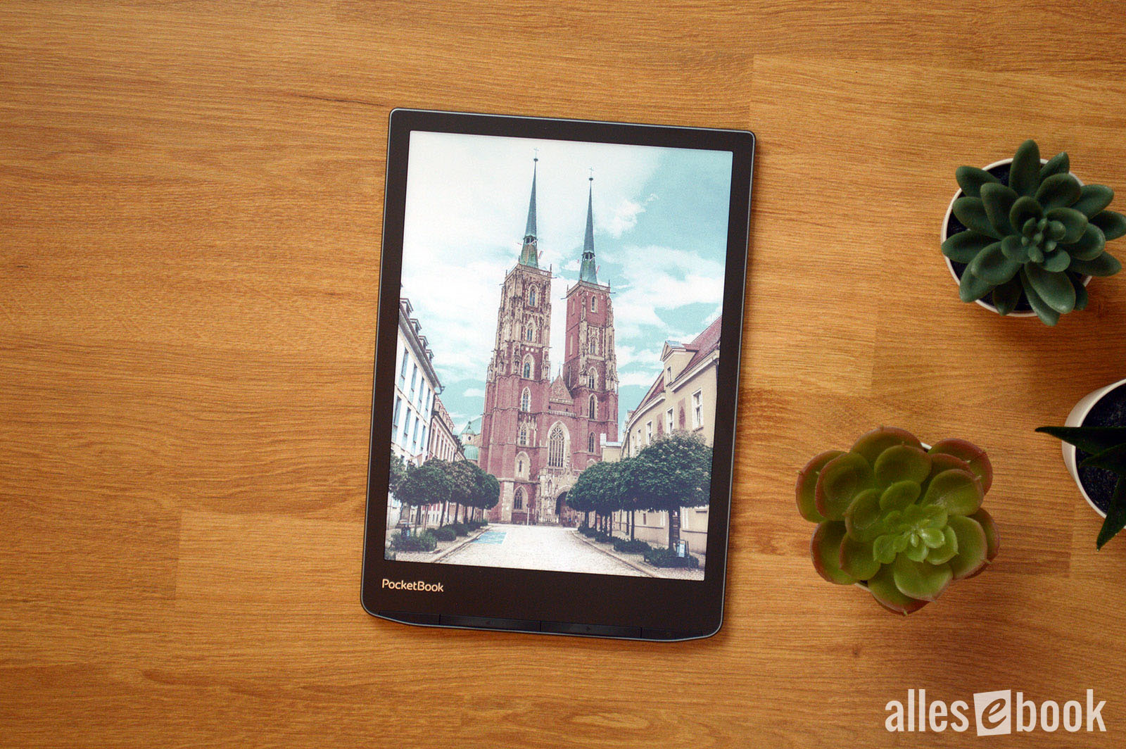
So if you want to show green, the panel darkens behind the red and blue subpixels. Because E Ink pixels can be darkened in grayscale rather than simply switching to black, the Kaleido 3 display can render 4,096 colors. Overall color reproduction is solid and only hits its limits with complex images.
Because of the RGB color layer, the screen is visibly darker without frontlight
This color-layer approach does have a drawback: the additional RGB coating noticeably darkens the screen. With the frontlight off, the experience is simply worse than on a regular E Ink Carta display like the InkPad 4’s. That applies to all Kaleido devices, regardless of brand.
So you should buy an E Ink Kaleido color eReader with the understanding that you’ll generally use it indoors with the frontlight on. With the light on, readability is excellent and this drawback is largely neutralized. Accordingly, almost all photos in this review were taken with the frontlight enabled—which, in my view, best reflects real-world use.
With the light on, the PocketBook InkPad Color 3 is very easy to read
The only minor downside compared to the InkPad Color 2 is a slightly darker appearance with the light off. Because the InkPad Color 3 has higher pixel density, the screen looks a touch darker. It’s not a real issue, though, since—as mentioned—you’ll normally use the frontlight on both devices anyway.
Display quality
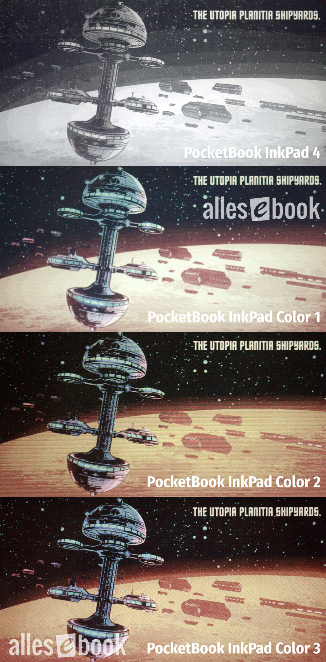
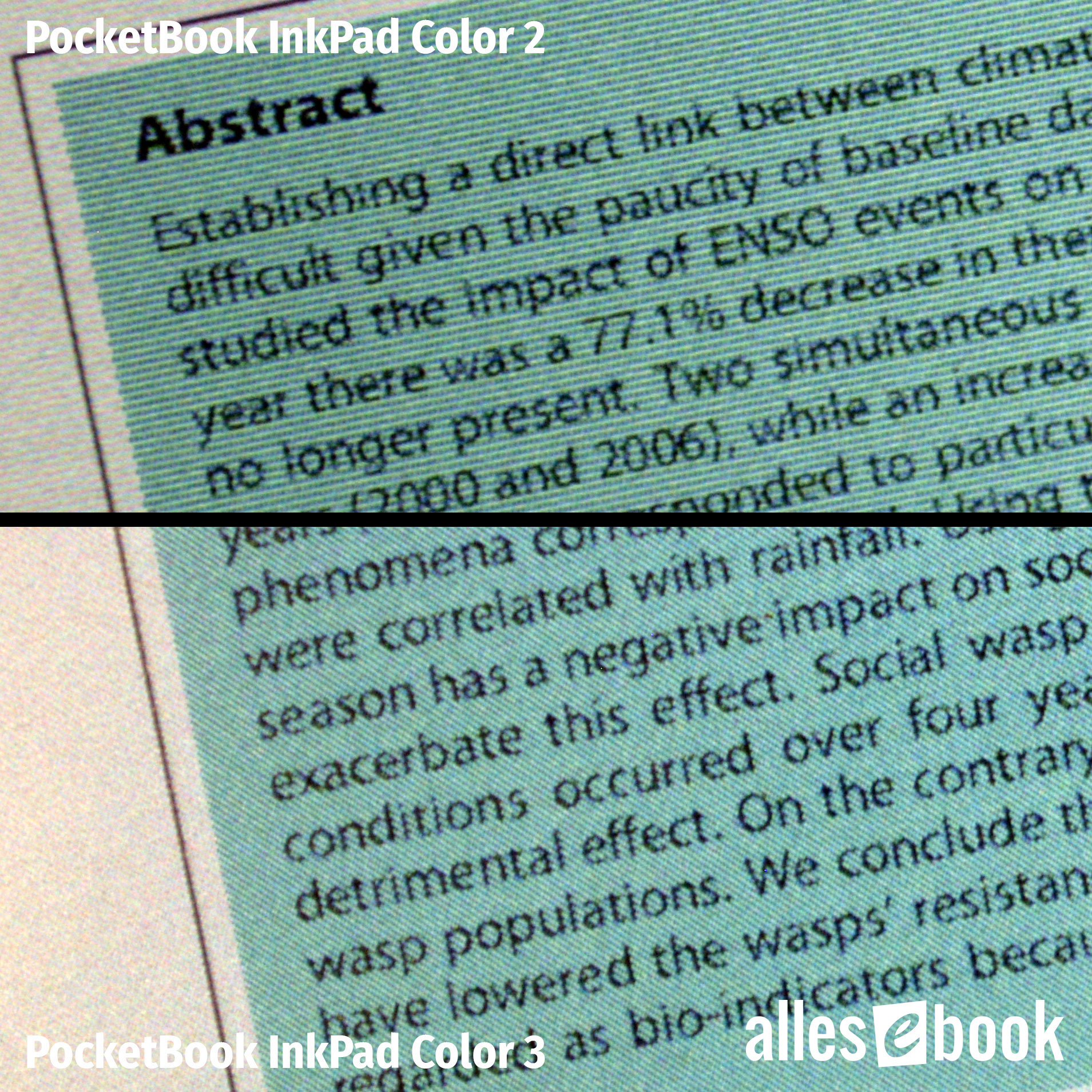
The fundamental workings haven’t changed with Kaleido 3. The key difference is the 50% higher color resolution. From 100 ppi on the previous model, the InkPad Color 3’s color layer jumps to 150 ppi.
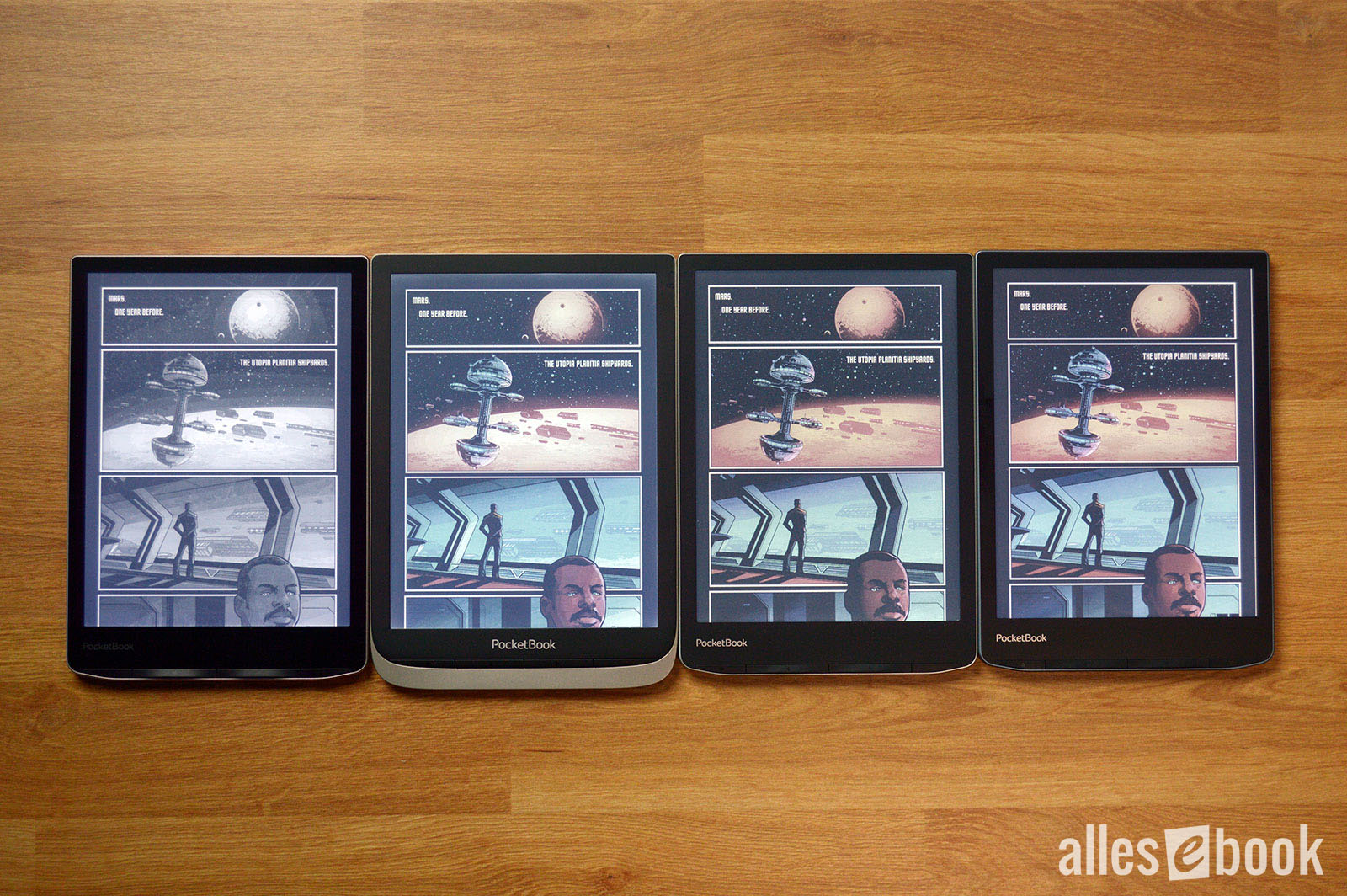
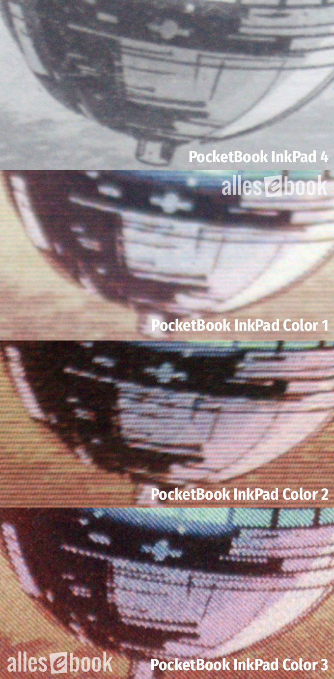
PocketBook InkPad 4, InkPad Color 1, InkPad Color 2, and InkPad Color 3 showing the same comic page
Although that may not sound like much, I find the improvement makes a clear difference in display quality. My biggest gripe with Kaleido Plus was that you could see the RGB subpixels fairly easily with the naked eye. At a reading distance of about 30 cm, I could perceive them on the predecessor as a kind of sparkle.
That sparkle noticeably degraded the experience of reading pure text (black on white, no color). I also missed the paper-like feel that is typical of E Ink.
Close-up of the InkPad family comic page: The InkPad Color 3 clearly looks best
That’s different with the PocketBook InkPad Color 3: At 150 ppi, the subpixels are smaller. I wouldn’t say they’re completely invisible, but they’re much less noticeable. At around 30 cm, the Kaleido 3 display looks more paper-like than previous generations. At greater reading distances, I can’t see the subpixels at all.
The changed subpixel shape and layout also contribute to this impression. The small color dots are now square, and their diagonally appearing arrangement makes them less conspicuous to the eye.
 Zoomed in again: The InkPad Color 3 renders best</caption]
Color reproduction
This new subpixel layout also improves the rendering of color content in general. Beyond sharper colored text thanks to the higher resolution, colored areas look less dithered.
Color saturation is minimally better, but the difference is so small it barely merits mention. The gentle, pastel-like look hasn’t changed with the new display generation.
Still, just having color on an eBook reader is a very welcome bonus and, to my eyes, makes the interface feel more lively. That goes even more for colored content like comics, which simply look better. You get used to the pastel-like look quickly.
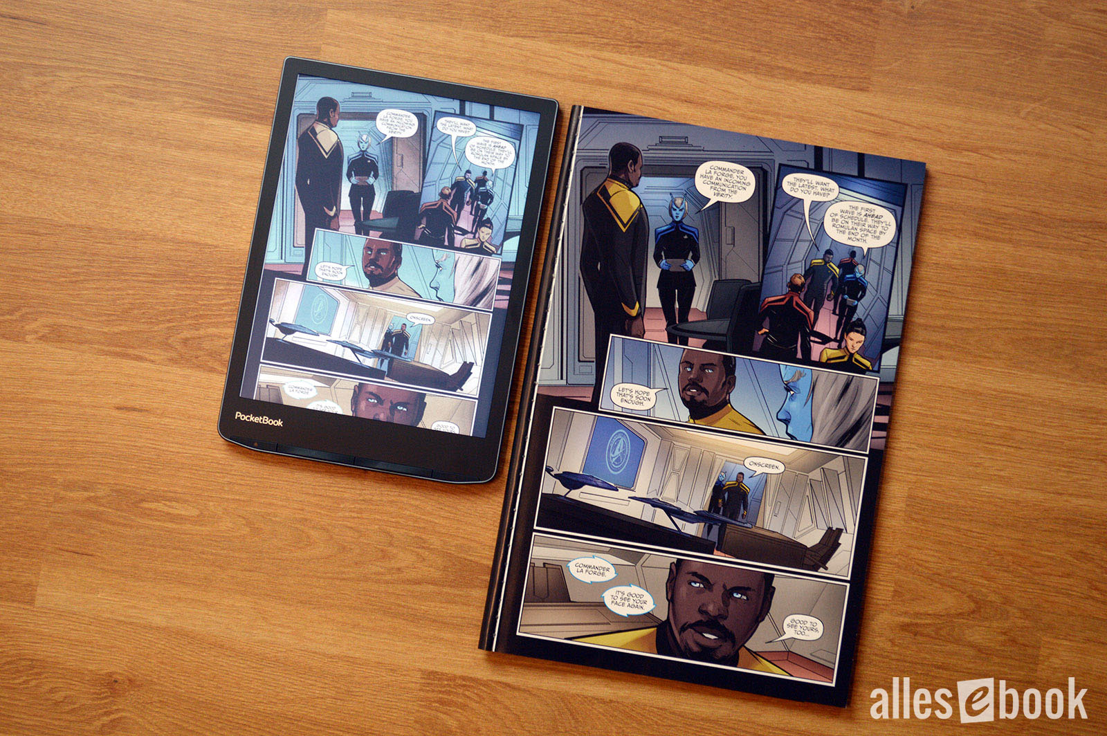
PocketBook InkPad Color 3 vs. paper comicIt’s important to note that E Ink Kaleido 3 still shares E Ink’s usual strength: excellent readability even in direct sunlight. So while color saturation is much lower than on an LCD tablet, outdoors the eReader clearly has the advantage thanks to the low-reflection surface and reflective display tech.
As for saturation, PocketBook should tweak the default settings a bit. To my eye, saturation is set a bit too high out of the box. Thankfully, PocketBook lets you adjust various parameters yourself. I found my best balance between image quality and color accuracy with these settings:
- Contrast +6
- Brightness -1
- Gamma 0.8
- Saturation -2
Of course, personal preference plays a role, and future software updates may change things. So it’s worth experimenting with the sliders yourself.
Frontlight quality and brightness
As with its predecessor, the PocketBook InkPad Color 3 offers very good frontlight quality. If you look closely, you can see a slight vertical brightness gradient, but it doesn’t detract from the reading experience. Especially with full-page color content (e.g., comic pages), you’ll hardly notice any frontlight unevenness—even if it’s more pronounced.
Contrast almost becomes a non-issue: with the light on, it’s excellent. Readability is outstanding with the frontlight enabled. Without it, the screen is, as mentioned, too dark for indoor use.
[caption id="attachment_84853" align="alignnone" width="700"]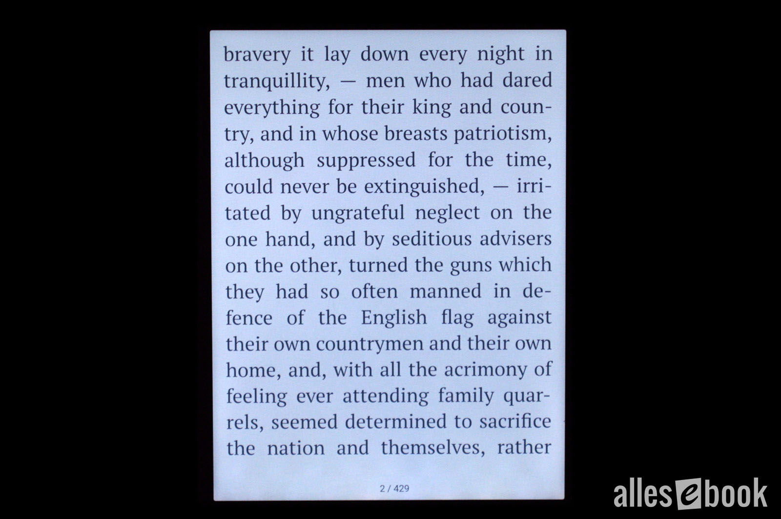 Even frontlight: 0% night light
The color temperature again ranges from cool white to warm orange. Notably, the cool-white setting at 7200 K is significantly cooler than on the InkPad Color 2. Since you can mix the light color yourself with a slider, that’s no problem. The night light sits at about 3100 K, similar to before.
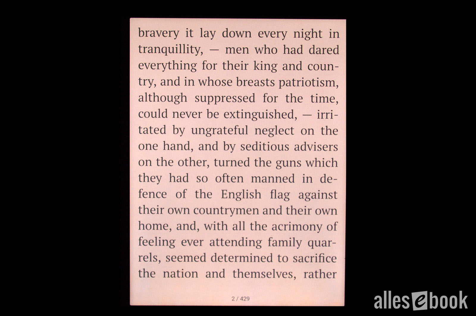 Frontlight with 50% night light</caption]
Maximum brightness is 54 cd/m² for the cool-white LEDs and 55 cd/m² for the warm-orange LEDs, slightly lower than the predecessor, but still more than bright enough for comfortable daytime reading. In the dark, you’ll turn the brightness down anyway—and here the PocketBook InkPad Color 3 shines again with a very low minimum brightness of 0.7 cd/m².
100% night light</caption]
As always with these values (brightness and color temperature), keep in mind that there can be unit-to-unit variation within a model line.
Maximum screen brightness in cd/m² (higher is better)
- Tolino Vision 5 (warm) 175
- Kindle Oasis 3 (cool) 170
- Tolino Shine 3 (warm) 146
- Kindle Oasis 3 (warm) 131
- Tolino Vision 5 (cool) 130
- Tolino Page 2 126
- Tolino Vision 6 (warm) 124
- Tolino Shine 3 (cool) 118
- Tolino Vision 6 (cool) 108
- PocketBook Touch HD 3 (cool) 90
- Kindle Paperwhite 4 90
- PocketBook InkPad 3 Pro (cool) 85
- Huawei MatePad Paper 81
- PocketBook InkPad 3 (cool) 79
- PocketBook Touch HD 3 (warm) 75
- PocketBook InkPad 3 Pro (warm) 73
- PocketBook InkPad Color 2 (cool) 71
- PocketBook InkPad 3 (warm) 69
- PocketBook Era (cool) 63
- PocketBook InkPad 4 (cool) 63
- PocketBook InkPad Color 2 (warm) 59
- PocketBook Era (warm) 59
- PocketBook InkPad 4 (warm) 55
- PocketBook InkPad Color 3 (warm) 55
- PocketBook InkPad Color 3 (cool) 54
- PocketBook InkPad X (cool) 50
- PocketBook InkPad Lite (cool) 47
- PocketBook InkPad X (warm) 44
- PocketBook InkPad Lite (warm) 36
Minimum screen brightness in cd/m² (lower is better)
- PocketBook Color 3.1
- Tolino Page 2 3.1
- Tolino Shine 3 (warm) 2.7
- Tolino Vision 5 (warm) 2.7
- Tolino Shine 3 (cool) 1.8
- Huawei MatePad Paper 1.6
- Tolino Vision 5 (cool) 1.2
- Tolino Vision 6 (cool) 1.2
- Tolino Vision 6 (warm) 1.0
- PocketBook InkPad Color 2 0.9
- PocketBook InkPad 4 0.8
- PocketBook Inkpad 3 0.7
- PocketBook Inkpad 3 Pro 0.7
- PocketBook Touch HD 3 0.7
- PocketBook InkPad Color 3 0.7
- PocketBook Era 0.7
- Kindle Oasis 3 0.6
- PocketBook Inkpad X 0.4
- PocketBook Inkpad Lite 0.1
Touchscreen and ghosting
You primarily operate the eReader via the fast, precise touchscreen, along with PocketBook’s signature hardware buttons below the display.
Ghosting is minimal with pure text, so while you can make out a faint “shadow” of the previous page, it’s so weak that it isn’t distracting.
It’s a different story with images. Here, a full screen refresh is advisable, as ghosting can be more pronounced. A full refresh reliably fixes it.
Frontlight and night-light automation
The PocketBook InkPad Color 3 still lacks sensors to automatically adjust screen brightness to ambient light. In true PocketBook fashion, however, there’s a time-based automation feature.
You can customize it, defining brightness and night light over the course of the day using a simple time graph.
[caption id="attachment_84849" align="alignnone" width="700"]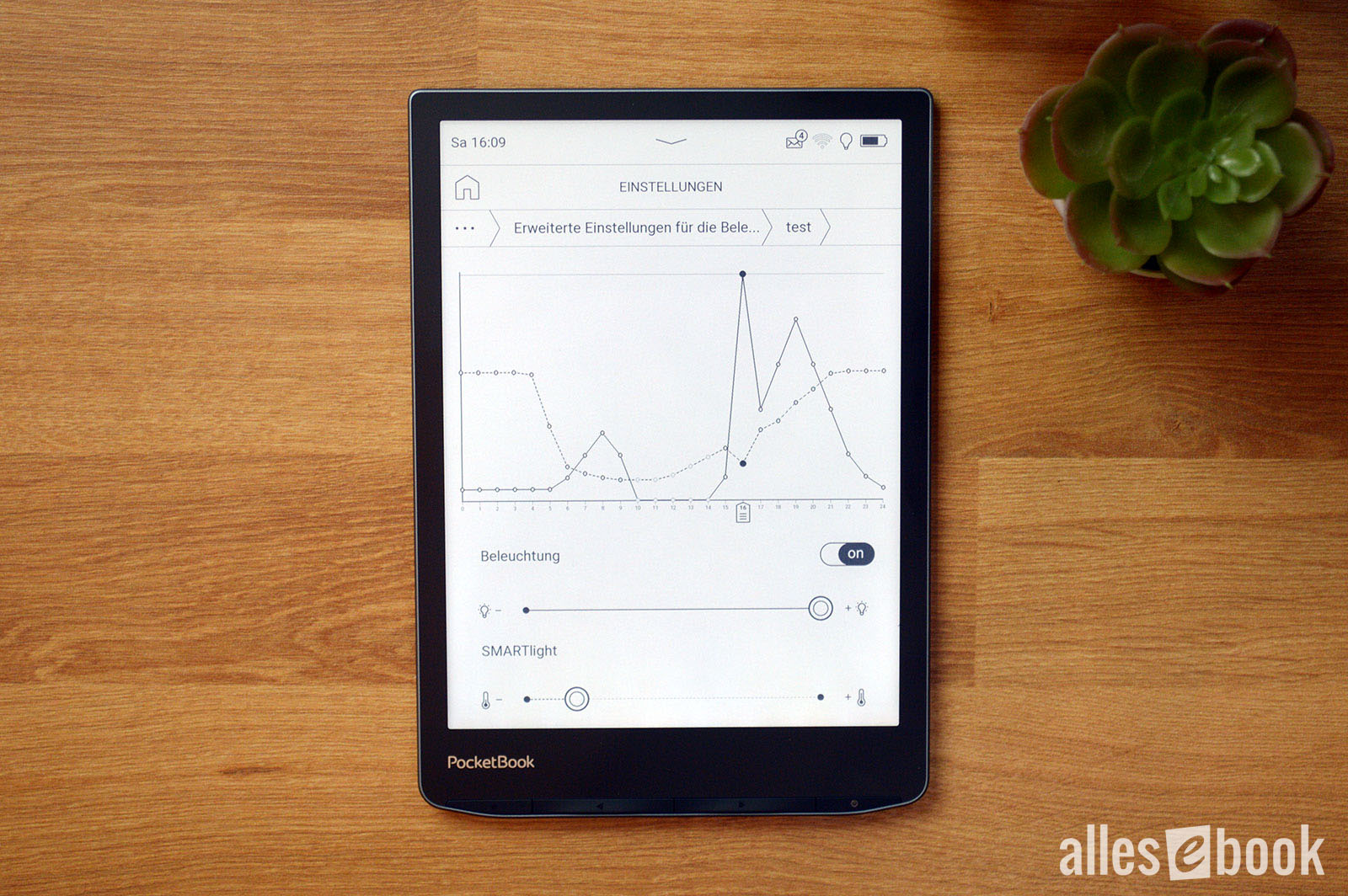 Handy time-based automationThis approach has pros and cons: The upside is that sudden changes in ambient light don’t trigger abrupt shifts, so you won’t suffer from constantly fluctuating brightness. The downside is that the light doesn’t react directly to the environment, so you may need to adjust it manually at times.
Overall, I still like this solution a lot—especially in the evening, when lighting conditions don’t vary much from day to day. The customization options are a welcome bonus for power users.
Interim verdict: display
It often happens when you least expect it: shortly after launching the InkPad Color 2, PocketBook already released the successor—and it fixes my biggest complaint about the color display.
The PocketBook InkPad Color 3 scores with higher pixel density that delivers a better user experience. In my view, the difference is much bigger than the seemingly modest 50 ppi increase would suggest on paper.
The less conspicuous subpixels and the resulting
[caption id="attachment_84820" align="alignnone" width="700"]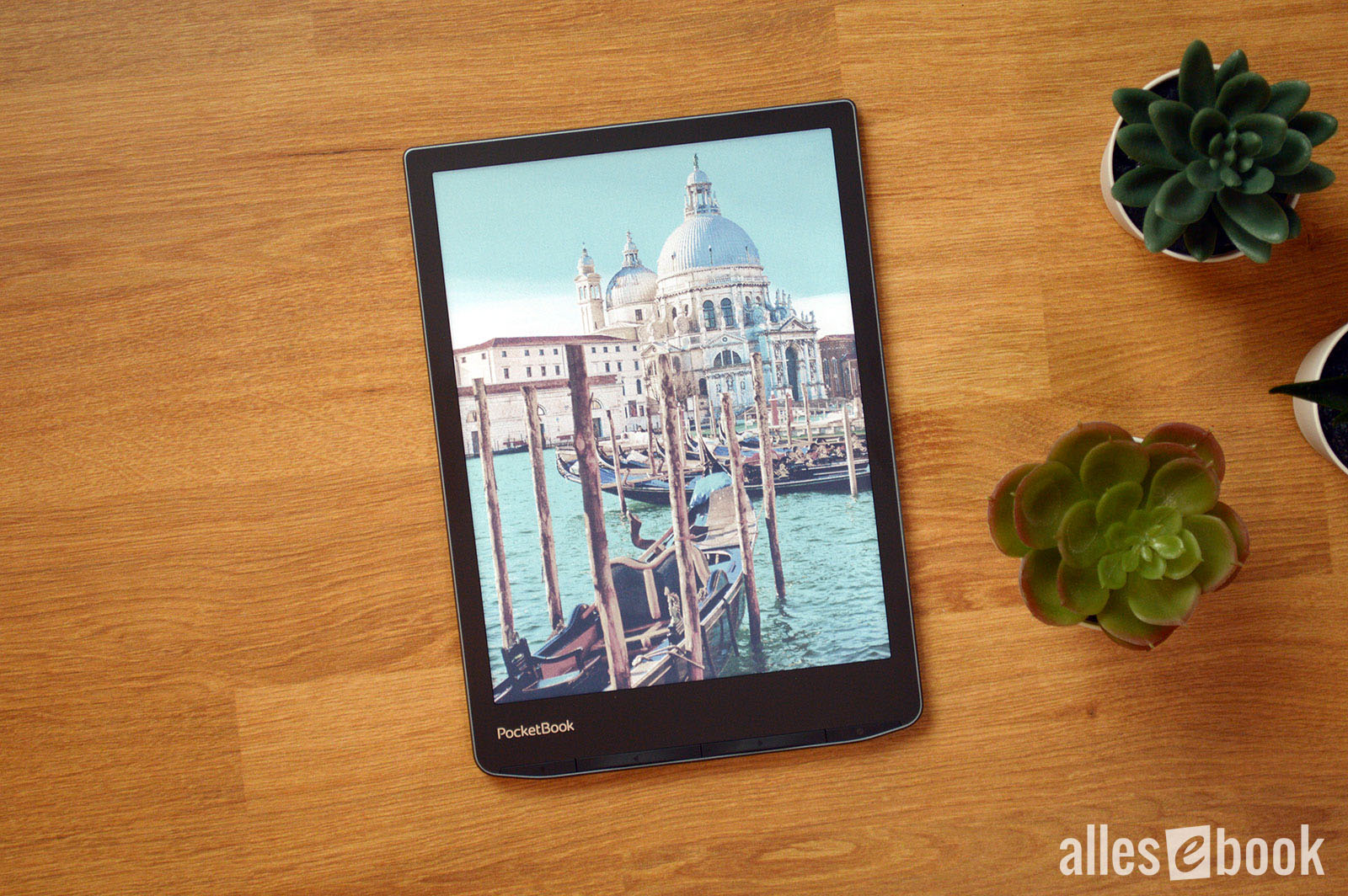 Great color and image quality thanks to E Ink Kaleido 3—provided the frontlight is on
paper-like appearance make the InkPad Color 3 a great display not just for comics and magazines, but also for pure text reading.
Of course, you still need the right expectations, because Kaleido 3 isn’t perfect: Without the frontlight, the screen is noticeably darker than grayscale E Ink, and color saturation can’t match LCDs in tablets or phones.
If you’re aware of these points, there’s little to criticize about the screen. On the contrary: the InkPad Color 3’s color display is a joy to use.
Reading and ease of use
Over the past few years, PocketBook has refined its software and UI significantly. As a result, usability now rivals Amazon and Tolino—and in some details even surpasses them—despite offering a wide range of features.
Privacy-conscious users will also find the InkPad Color 3 appealing. You don’t need to sign into the built-in store if you don’t want to—and you can still use every device feature without restrictions (aside from buying eBooks and audiobooks, of course). PocketBook has also stopped collecting anonymous usage statistics. These were already optional before; now they’re not collected at all.
This means the PocketBook InkPad Color 3 offers both the convenience of the integrated store and the option of a more privacy-friendly setup.
Below are the key features at a glance. The test used software version U743k3.6.8.2193.
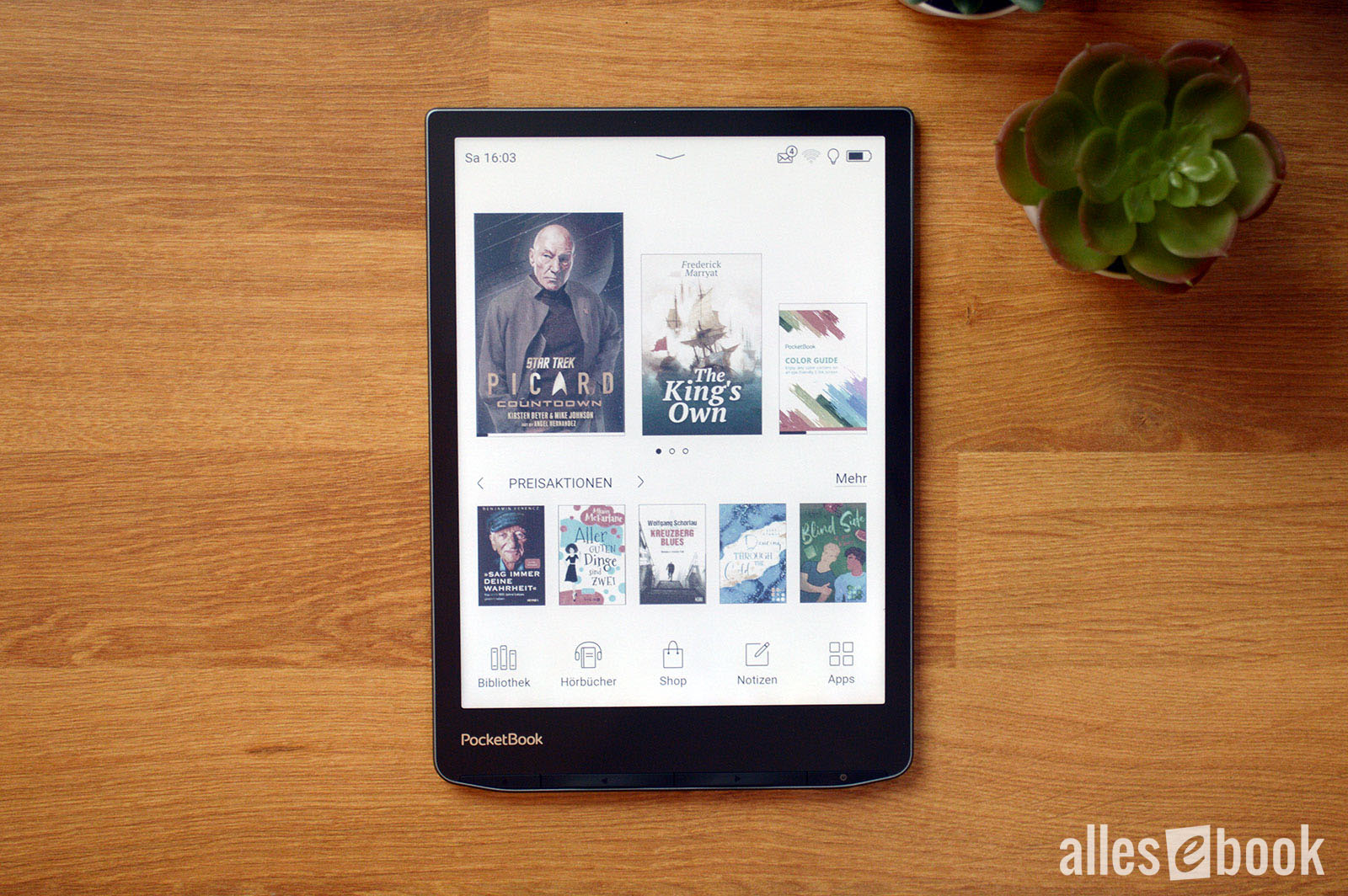
Home screen
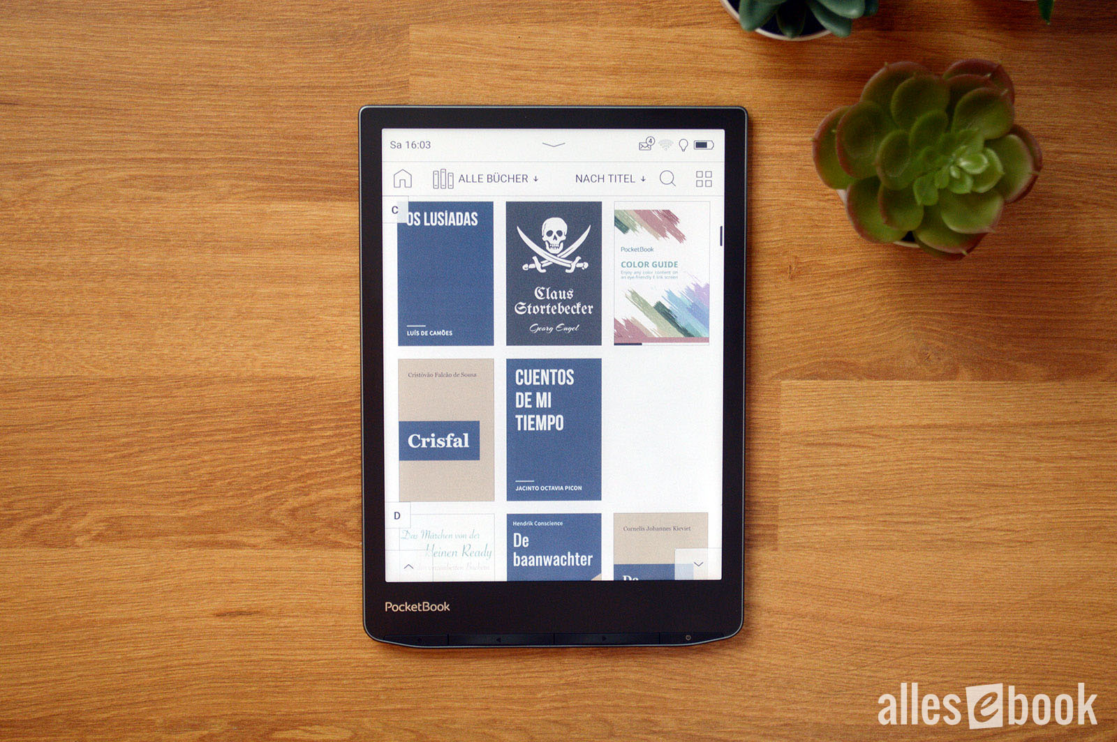
The InkPad Color 3’s home screen sticks to PocketBook’s tried-and-true design. At the top, you see the three most recently read or added titles; underneath are recommendations from the integrated eBook store.
One PocketBook differentiator is the option to hide these store recommendations. This is available if you bought the device directly from the manufacturer. If you purchased through a partner store, there may be differences.
 Familiar home screen</caption]
Hiding store recommendations changes the home screen slightly: the four most recently read or added eBooks are shown larger in the middle of the screen, and the store section disappears.
The status bar at the top provides quick access to lighting, Wi-Fi, and sync. These quick settings can now be customized.
At the bottom are five app shortcuts: Library, Audiobooks, Store, Notes, Apps. These shortcuts can also be customized.
Library
The InkPad Color 3’s library offers extensive filtering and sorting options. You can filter by authors, genres, collections, favorites, folders, formats, and the PocketBook Cloud. Sorting by open date, date added, title, and author is also available.
The default is cover view, but you can switch to a more compact list showing title and author as text.
As usual for PocketBook, the book list scrolls vertically and smoothly. It feels a bit unusual at first, but quickly becomes very convenient. Alternatively, you can use the page-turn buttons or virtual buttons to move through the library page by page.
PocketBook still has the best library features—by far</caption]
The device supports both a folder structure and Calibre’s tag system. So if you already use one of these systems to organize your library, you can keep using it without reworking anything.
With the InkPad Color 3, PocketBook remains the vendor with the best library functionality on the market.
Reading
While reading on the InkPad Color 3, you can turn pages by tapping or swiping the touchscreen or by using the hardware buttons. You can also customize touch zones with predefined actions.
You can tweak things like margins, line spacing, font size (from 6 to 40 pt), and hyphenation. You can change fonts and choose Regular, Bold, or Italic. You can also install your own fonts if your favorite isn’t included.
[caption id="attachment_84838" align="alignnone" width="700"]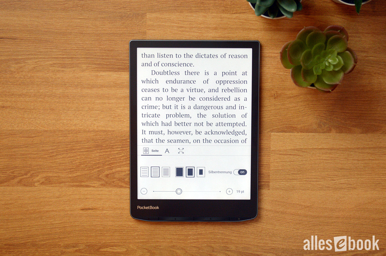 Solid font customization</caption]
PocketBook also lets you hide various on-screen elements, including page numbers, the status bar, remaining pages to chapter end, and “virtual” page numbers. For the latter, the software dynamically calculates reading position based on your chosen font size. The initial calculation can take a moment.
Highlights and notes
In advanced note mode, all options appear at the top of the screen as follows:
- Highlight
- Write a note
- Handwritten highlight
- Eraser
- Screenshot (with size selection)
Besides handwritten markup, the advanced mode can also save time. While paging with the buttons, the options bar at the top stays fixed. This lets you add new highlights and notes with a single tap, without having to long-press a word each time to open the context menu. It’s particularly handy if you annotate frequently.
[caption id="attachment_84834" align="alignnone" width="700"]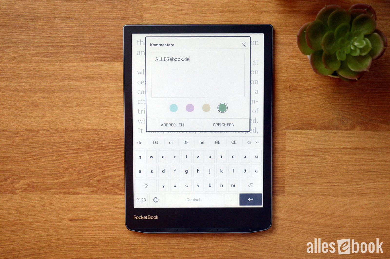 Note-taking with color coding</caption]
Thanks to the color display, highlights and notes can be color-coded. Notes can also be exported in HTML format. At the moment, handwritten notes can’t be exported; they appear as references only.
Dictionaries
The PocketBook InkPad Color 3 offers a huge selection of free dictionaries (see below) that now recognize grammatical forms more reliably than before. If there’s no exact match, the dictionary looks for the closest word, which works well in most cases. If it does pick the wrong word, you can correct it with the on-screen QWERTZ keyboard and search manually.
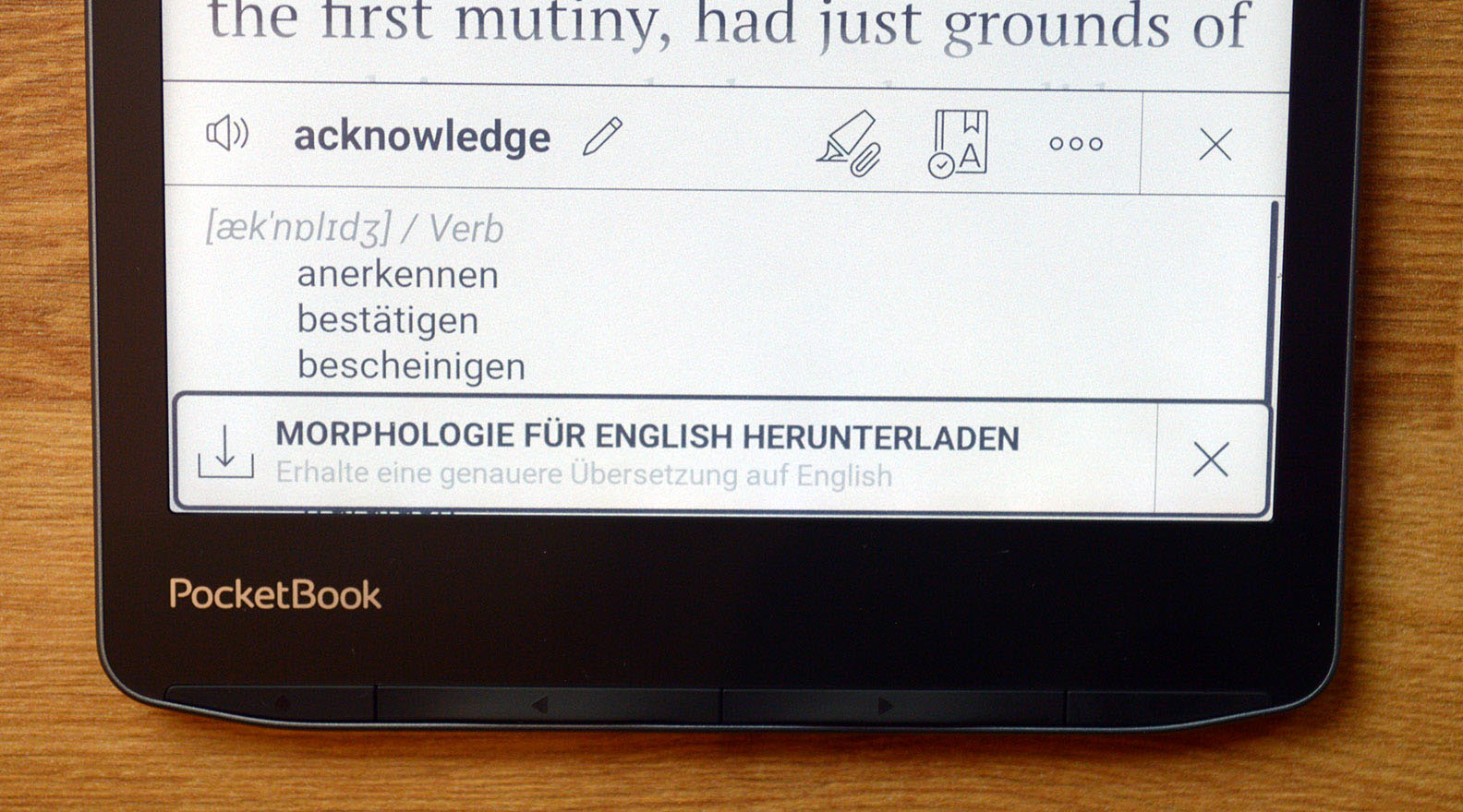
There is at least a special dictionary mode that mitigates this. When it’s active, you can look up a word with a single tap—at the expense of direct access to the context menu. So if you want to add a note, you have to exit dictionary mode first.
Other additions from the InkPad 4 include adjustable font size in the dictionary panel and the ability to add a note directly for the looked-up word, letting you build a vocabulary list for study.
You can also have the looked-up word read aloud using Text-to-Speech (see below) through the built-in speaker.
The following dictionaries can be downloaded directly from the UI (provider: PocketBook unless otherwise noted):
- Arabic -> English
- Armenian -> English
- Azerbaijani -> English
- Chinese (simplified) -> English
- Chinese (traditional) -> English
- Czech -> English
- Dutch -> English
- English -> Arabic
- English -> Armenian
- English -> Azerbaijani
- English -> Chinese (simplified)
- English -> Chinese (traditional)
- English -> Czech
- English -> Dutch
- English -> English (Webster’s 1913)
- English -> Estonian
- English -> French
- English -> German
- English -> Greek
- English -> Hebrew
- English -> Hungarian
- English -> Italian
- English -> Latvian
- English -> Lithuanian
- English -> Polish
- English -> Portuguese
- English -> Romanian
- English -> Russian
- English -> Slovak
- English -> Spanish
- English -> Swedish
- English -> Turkish
- English -> Ukrainian
- Estonian -> English
- French -> English
- German -> English
- German -> Russian
- Greek -> English
- Hebrew -> English
- Hungarian -> English
- Italian -> English
- Italian -> Italian (Wiktionary)
- Latvian -> English
- Lithuanian -> English
- Polish -> English
- Portuguese -> English
- Romanian -> English
- Slovak -> English
- Spanish -> English
- Spanish -> Spanish (Wiktionary)
- Swedish -> English
- Turkish -> English
- Ukrainian -> English
This likely makes PocketBook’s dictionary feature the most internationally accessible one on the market today.
Unlike my list, the dictionaries are organized on the device by source language, which is much clearer. You can also delete dictionaries you don’t need, which makes switching between them easier. If you need one again later, you can simply re-add it via the menu.
Audiobooks, music, and Text-to-Speech
Like several other PocketBook models, the InkPad Color 3 can play audio via Bluetooth or the built-in speaker.
Using the speaker is straightforward: once you enable audio playback in the player, the sound is played through the speaker immediately. You can adjust the volume directly in the UI.
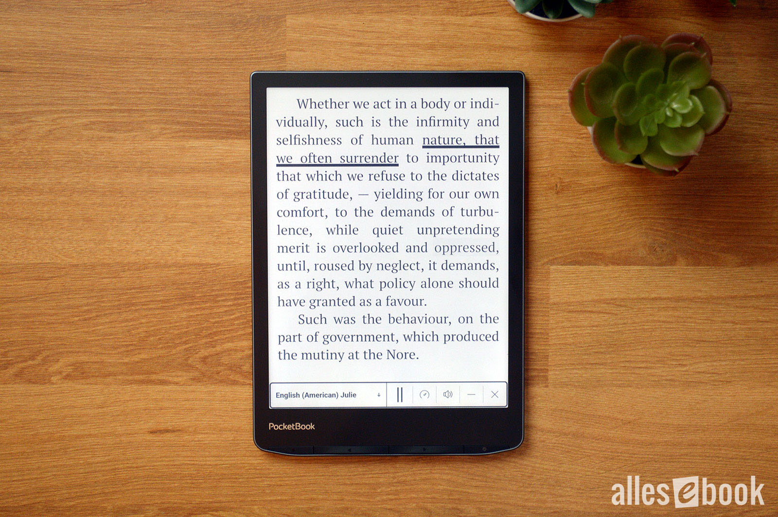
Besides playing music or audiobooks in the respective players, there’s also a Text-to-Speech (TTS) feature. This reads the text of an eBook with a synthetic voice.
To use TTS, enable it in a book’s “Voice” menu. Playback controls then appear at the bottom of the screen. For various languages, there are (sometimes multiple) male and female voices available for download. You can download them right in the UI in just a few minutes.
 Good Text-to-Speech</caption]
The text currently being read is clearly underlined, making it easier to follow along. You can also adjust speech rate.
The TTS engine is very good, even if it can’t match the latest AI voices, e.g., Apple’s. As a reading aid or for short drives, it’s more than sufficient.
The music player offers standard functions: add individual files or whole folders, create M3U playlists, edit playlists by deleting or reordering tracks, shuffle, and repeat. The player runs in the background, so you can read and listen at the same time if you like.
The audiobook player is similar but omits features that don’t make sense for audiobooks, like shuffle and repeat. Having separate players for music and audiobooks keeps things clear and organized.
[caption id="attachment_84822" align="alignnone" width="700"]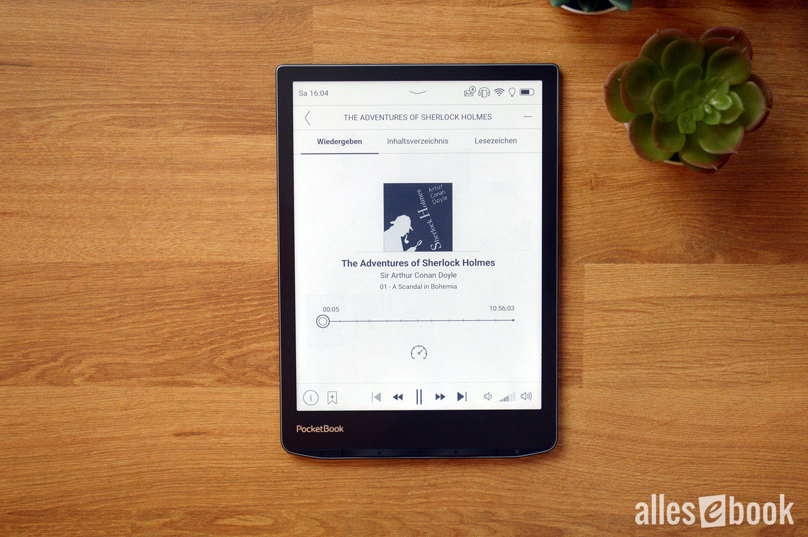 Audiobook player in actionA major advantage over Amazon’s audiobook setup (Kindle, Paperwhite, Oasis & Scribe) is that you’re not tied to a single provider like Audible. You can use audiobooks from various sources. Audible itself isn’t supported, but that’s a small price to pay for provider freedom and the ability to use free audiobooks—without being locked to one ecosystem. At the same time, you still have the convenience of the built-in PocketBook store if you want it.
PDF functionality and readability
Compared to other mainstream vendors (Amazon, Tolino, Kobo), PocketBook still offers the best PDF rendering. Even though the 7.8-inch display isn’t ideal for large A4 documents, software features make big documents quite usable overall.
[caption id="attachment_84835" align="alignnone" width="700"]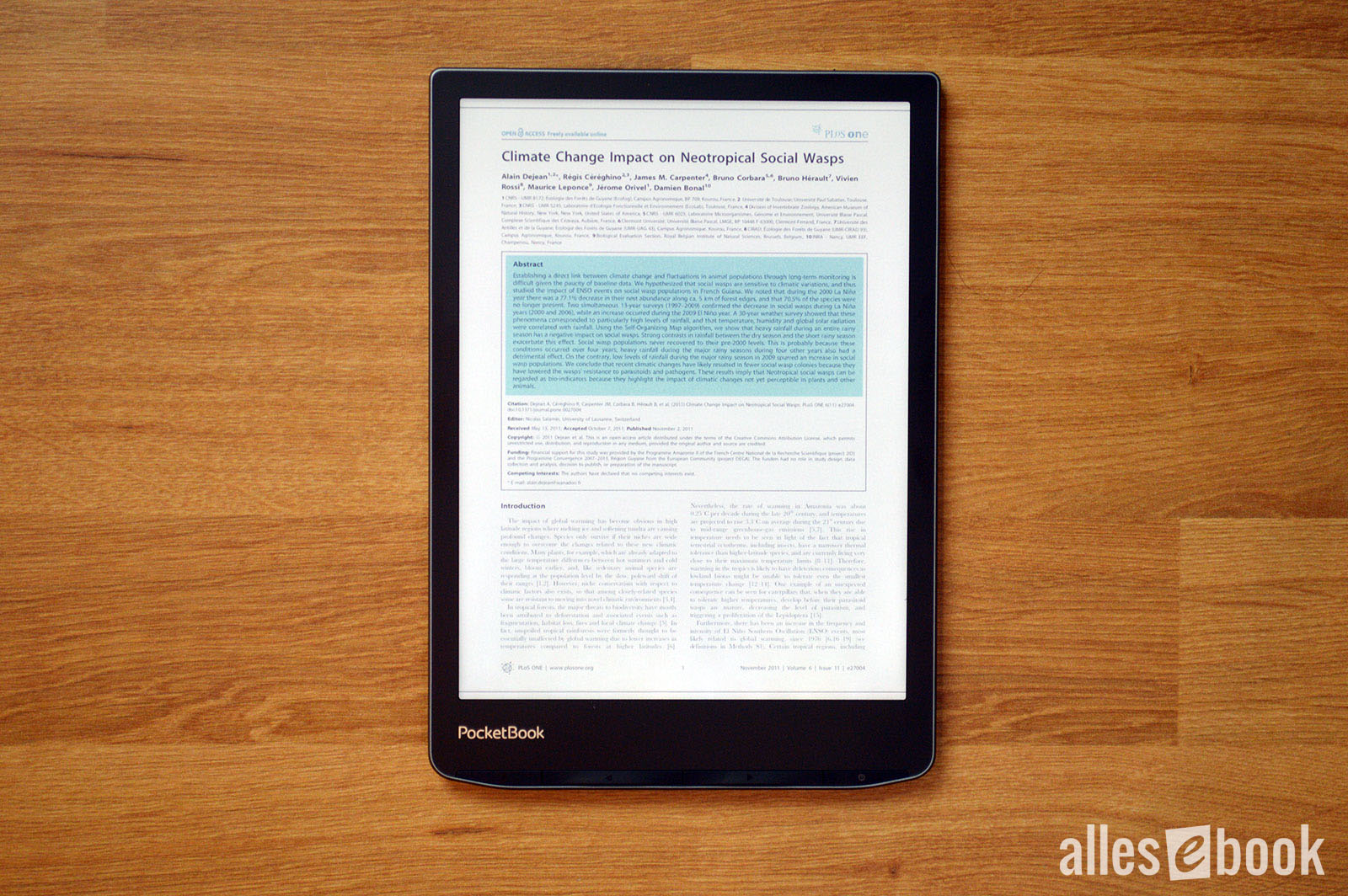 PDF on the InkPad Color 3
These view options are available:
- Scroll mode: smoothly scroll through PDFs.
- Single-page view: shows one page at a time.
- Column view (2 & 3): splits the PDF into two or three vertical sections, handy for multi-column layouts.
- Reflow: adapts the layout to the screen size, reflowing text and images. This helps on small screens, but can cause formatting issues with complex layouts.
- Zoom (30 to 300%): zoom in and out.
- Crop (off, automatic, manual): trims margins to display more text.
- Adjustments (gamma, brightness, contrast, saturation): tweak gamma, brightness, contrast, and saturation to improve readability (see display section).
In testing, the InkPad Color 3 handled large, image-heavy PDFs without issue and showed no stability problems. The faster processor is noticeable here as well, making PDF use more responsive. Only pinch-to-zoom could be a bit snappier for my taste.
Tiny text: Thanks to 150 ppi, tinted content is more legible on the InkPad Color 3
Color is a clear advantage when viewing color PDFs and other fixed-layout documents like comics and manga in CBR/CBZ format. That said, the 7.8-inch screen is borderline small for many such titles—not too small, but definitely a compromise despite solid software. The landscape mode helps a lot here, offering a more comfortable view of large-format files—provided the layout suits it.
eBook store and PocketBook Cloud
With built-in Wi-Fi, the InkPad Color 3 lets you buy eBooks directly from the integrated store. The exact store varies depending on where you bought the device, but the basic functionality is the same and tied into the PocketBook Cloud.
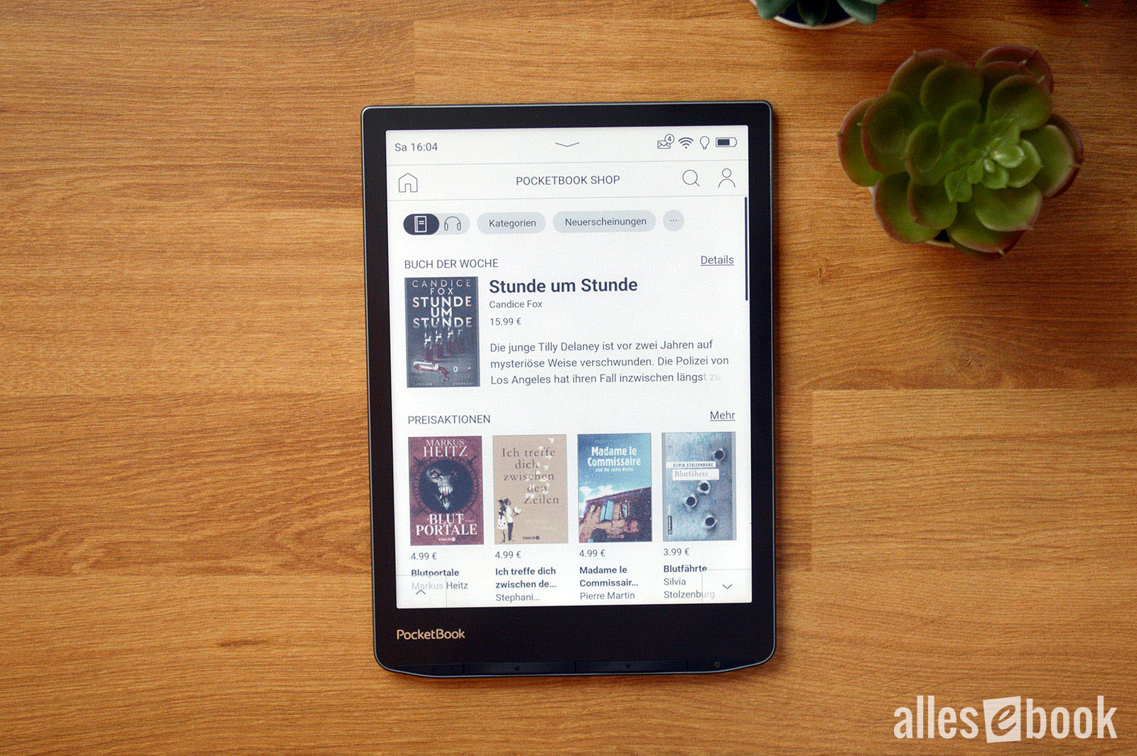 Built-in eBook and audiobook store</caption]
To buy eBooks or audiobooks, you need to register in the store and add a payment method. Purchased titles are automatically uploaded to online storage and can be synced with the eReader. A separate PocketBook Cloud account has not been required for some time now, which makes things much simpler.
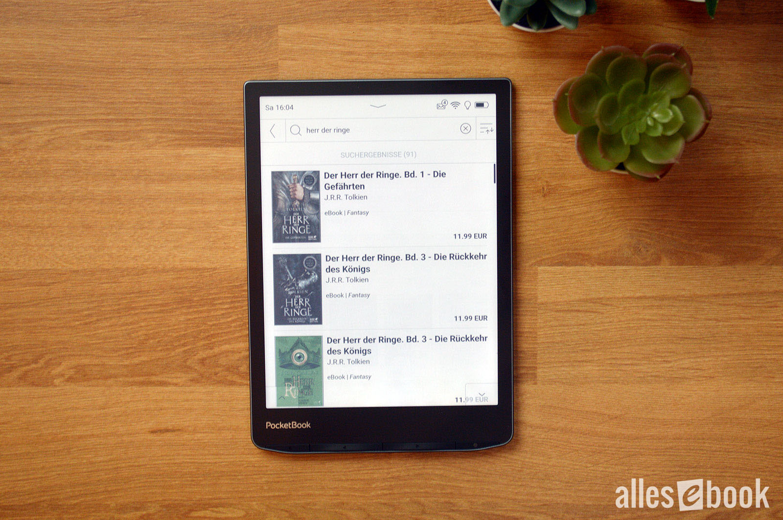
PocketBook has also improved the search function I criticized before, so you no longer have to scroll endlessly through results to find the right title. Nicely done!
 Improved store search</caption]
The InkPad Color 3 also supports syncing with Dropbox. This keeps the reader in sync with a cloud folder and enables a variety of workflows. For example, you can convert news feeds to ePub with Calibre and save them to a Dropbox folder so they appear on the eReader. It also makes it easier to transfer eBooks purchased on a PC.
Another handy feature is “Send-to-PocketBook,” which lets you email eBooks directly to the device.
Overall, the InkPad Color 3’s store and cloud functionality is intuitive and user-friendly—making eBook purchases as convenient as on Amazon—while surpassing Tolino. While Tolino partners still often use mobile versions of their online shops years after launch that don’t integrate well visually, the shopping experience on the PocketBook InkPad Color 3 is seamless and consistent.
Web browser and Onleihe
The InkPad Color 3’s web browser is reliable and generally renders pages correctly. It’s ideal for quick research or using alternative eBook stores.
Features include pinch-to-zoom, panning with page-turn buttons, landscape mode, and bookmarks. You can also disable images and JavaScript if needed. Thanks to the faster CPU, responsiveness is now very good (for E Ink). It’s on par with Tolino’s Android-based devices—and with color, it actually has an advantage for browsing.
For Onleihe use, the InkPad Color 3 offers a dedicated application. This special browser app is designed specifically for Onleihe, making borrowing eBooks easier and more convenient.
Support for CARE DRM makes reading Onleihe eBooks straightforward and a better alternative to Tolino eReaders, where the beta “tolino reading experience” often causes issues.
Conclusion
 When PocketBook introduced the InkPad Color 3, I wasn’t the only one surprised. After all, the predecessor hadn’t been on the market long—my review only went live at the end of August.
The quick switch is a welcome surprise, because the new E Ink Kaleido 3 technology eliminates my only substantial criticism of the predecessor. The seemingly modest increase to 150 ppi for the color filter sounds like little on paper, but—as described—it has a massively positive impact on rendering.
The biggest improvement is the display’s more paper-like look. Something E Ink usually does very well was more compromised with the prior Kaleido Plus tech. With Kaleido 3 in the InkPad Color 3, that changes: the screen simply looks better thanks to less visible subpixels and, as a result, it’s more enjoyable to read on.
The remaining two design-related drawbacks of Kaleido matter less in practice: the generally darker screen is easily brightened with the frontlight, and you quickly get used to the muted color saturation.
All in all, color is a real value-add. Even the home screen with color covers is simply more appealing. And of course, it shines in color comics, manga, or magazines, where the color screen noticeably improves the experience.
 The PocketBook InkPad Color 3 is my new favorite among PocketBook eReaders</caption]
In my view, the InkPad Color 3’s biggest downside is the price of 319 euros. That means you’ll pay a bit more than for the black-and-white InkPad 4. Still, the InkPad Color 3 is one of the most affordable E Ink Kaleido 3 devices on the market, and with our PocketBook.de coupon (see below) you can save another 10%, widening the price gap to competitors.
The InkPad Color 2 was already a good device that I could only recommend to a narrower audience due to its lower color resolution. With the InkPad Color 3, the circle of people I can recommend it to widens considerably. If you’re aware of the remaining (in my view) minor drawbacks, there’s little to complain about with PocketBook’s newest color eReader. Not only is viewing color content great—reading regular eBooks is much better thanks to Kaleido 3 as well.
Combined with the fast CPU, good feel in the hand, and huge feature set with an intuitive UI, color on the PocketBook InkPad Color 3 is simply fun. It pulls the color eReader out of the niche, and it’s well worth a look for anyone who enjoys digital reading.
Overall, thanks to its strong execution, the PocketBook InkPad Color 3 earns a solid score of 1.6.
If you decide to buy the eReader, you can save 10 percent (about 30 euros) on PocketBook.de with the coupon code “allesebook”:
 Versand*:
  Listenpreis*: